A retro cartoon-inspired brand character and animated film. Captan Zaptic to the rescue!
Challenge
Zaptic asked us to tell a story about how their product helps to improve efficiency and sustainability in production lines. Our job was to deliver the message in a way that was informative but also entertaining and memorable.
Inspiration
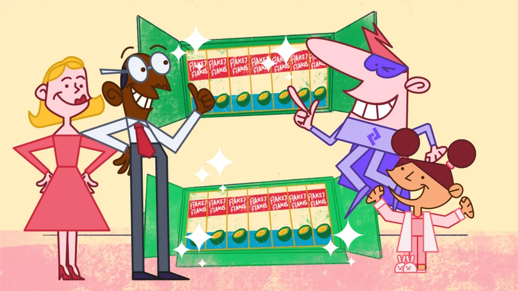
We developed an artwork style influenced by retro-style UPA informercials and early Hanna Barbera character design motifs.
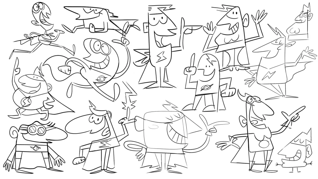
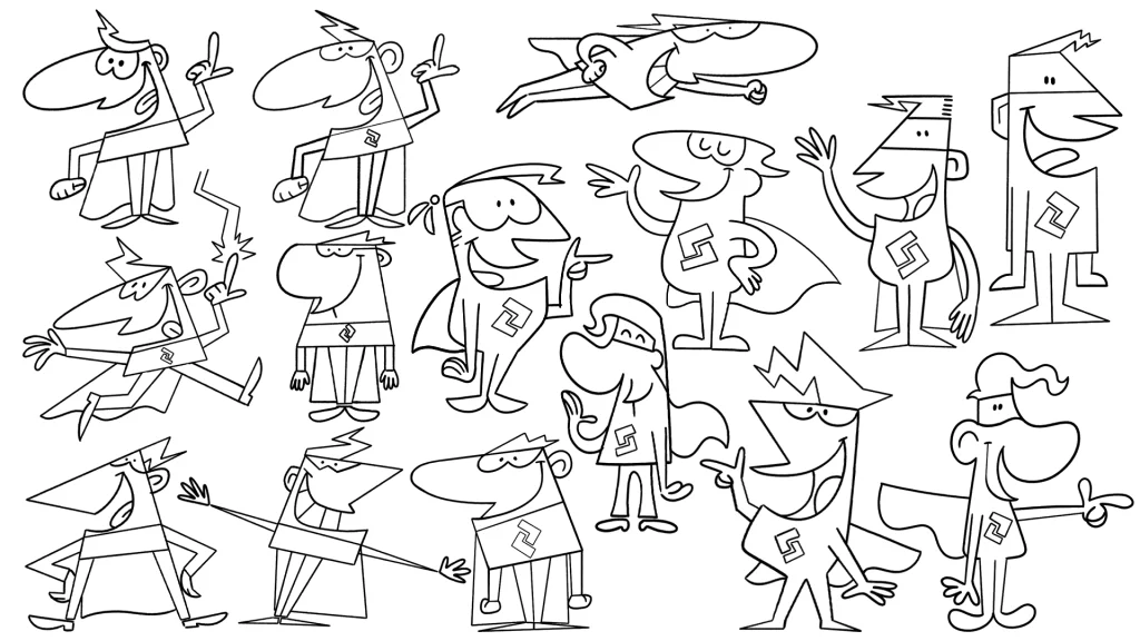
Through a process of experimentation with body shapes, facial features and poses, the final character design emerged.
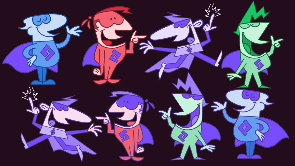
Colour palette
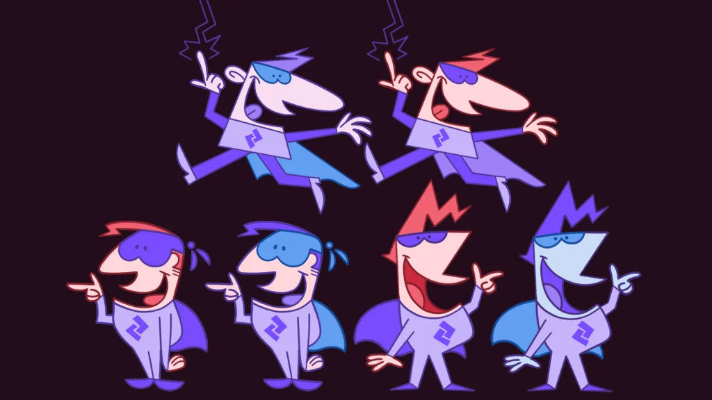
To achieve the retro look and feel we were looking for we tried lots of combinations of character designs, textures and colour palettes.
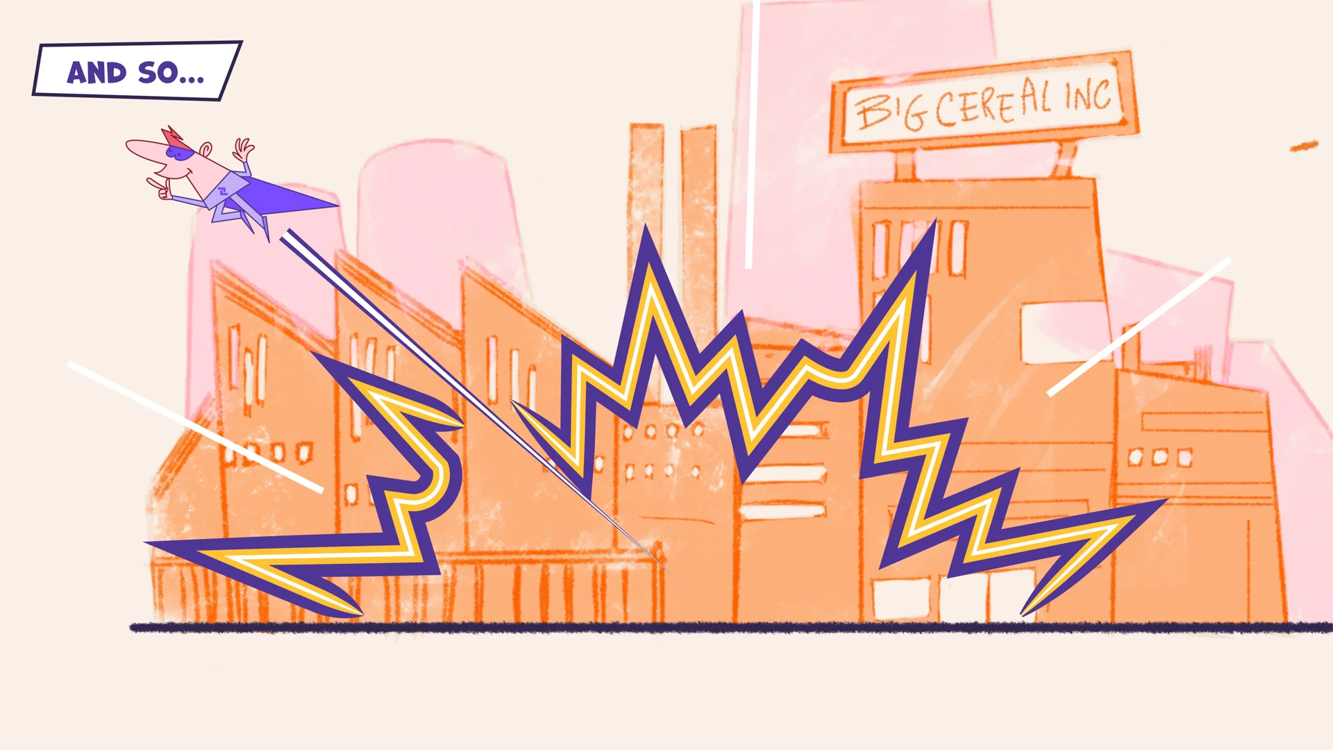
We wanted the main action in the shot to be the focal point so used a bold palette for characters, and a more neutral and lighter tints for the background art.
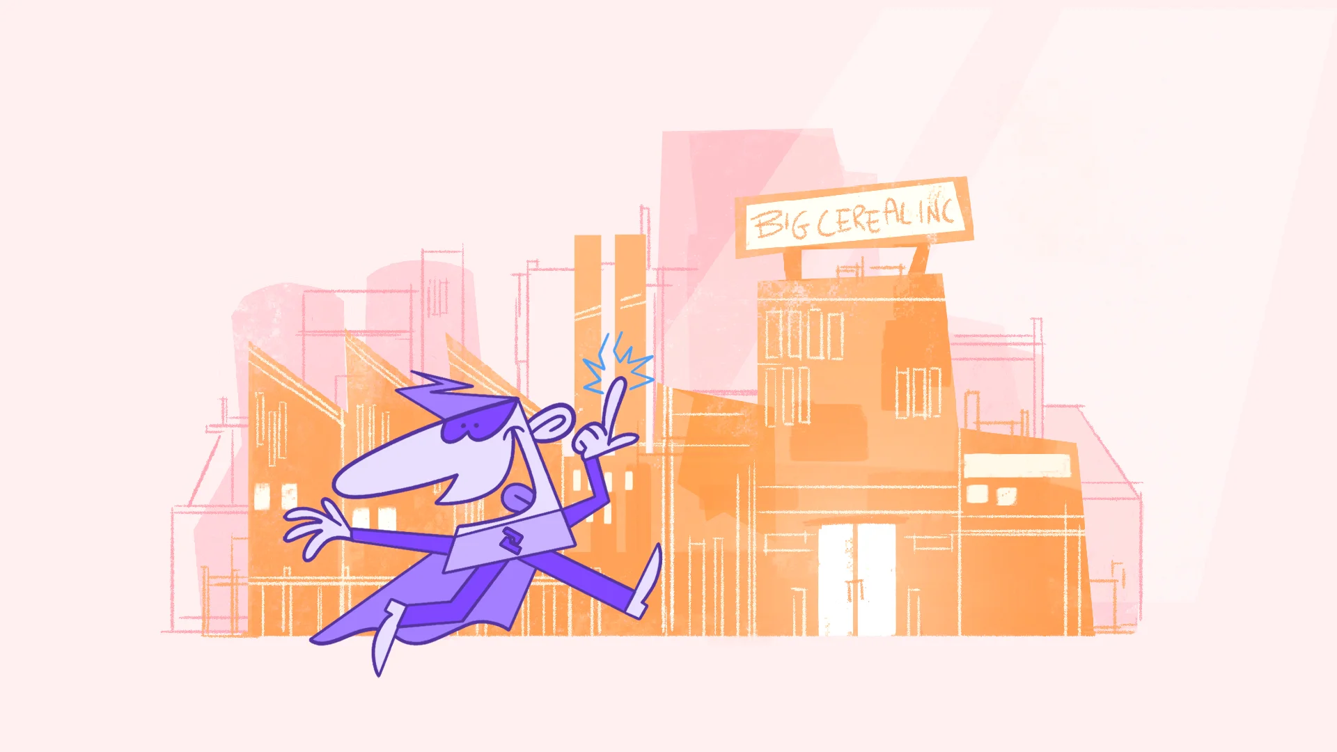
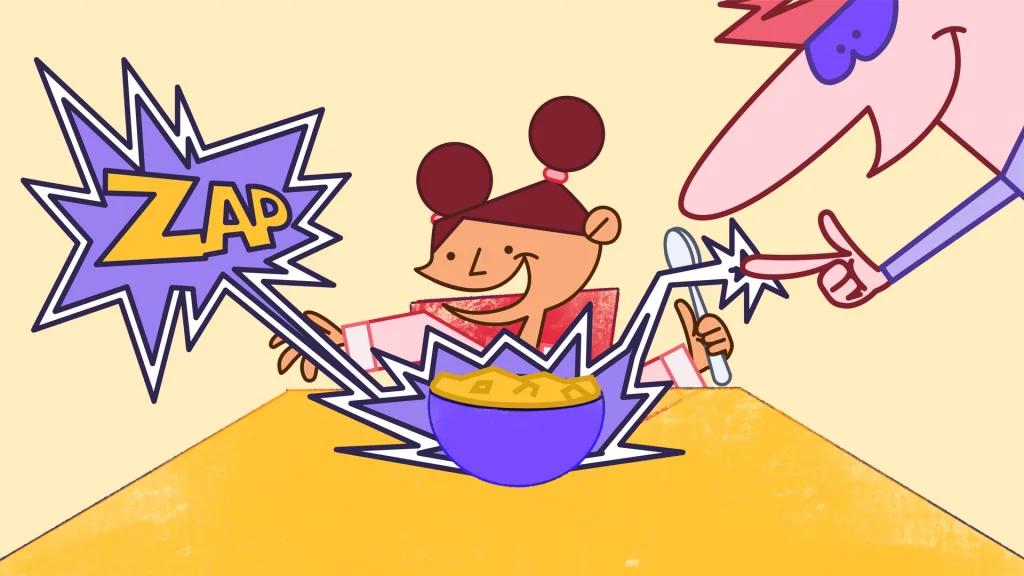
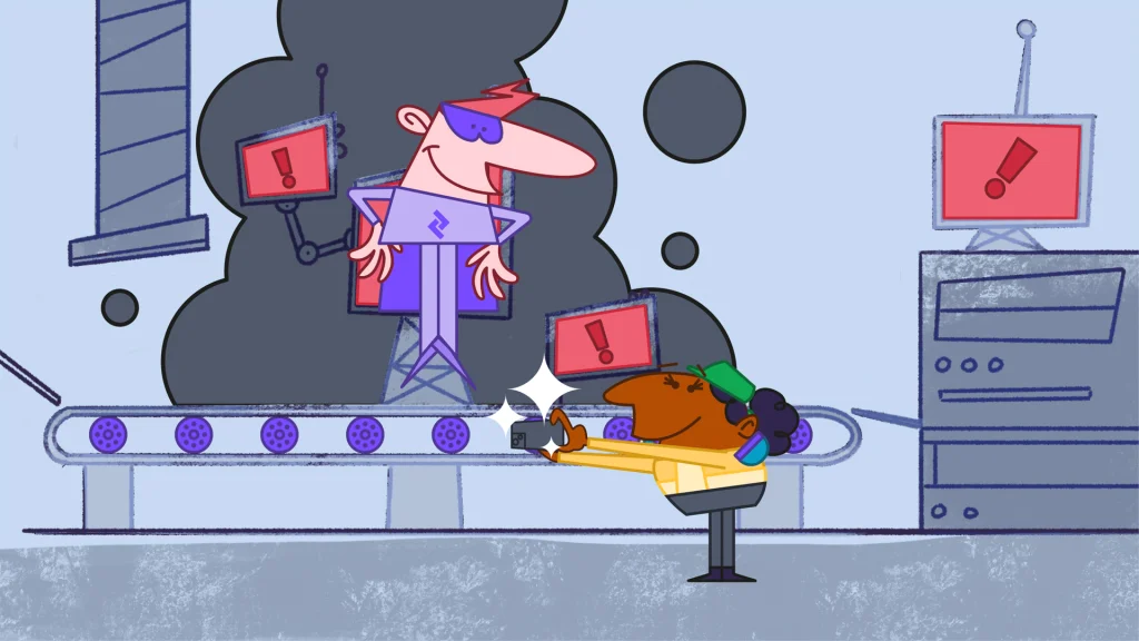
A classic superhero story
The story shows the impact the product has on improving productivity and efficiency in factory production lines, and improving sustainability by reducing the need for paper.
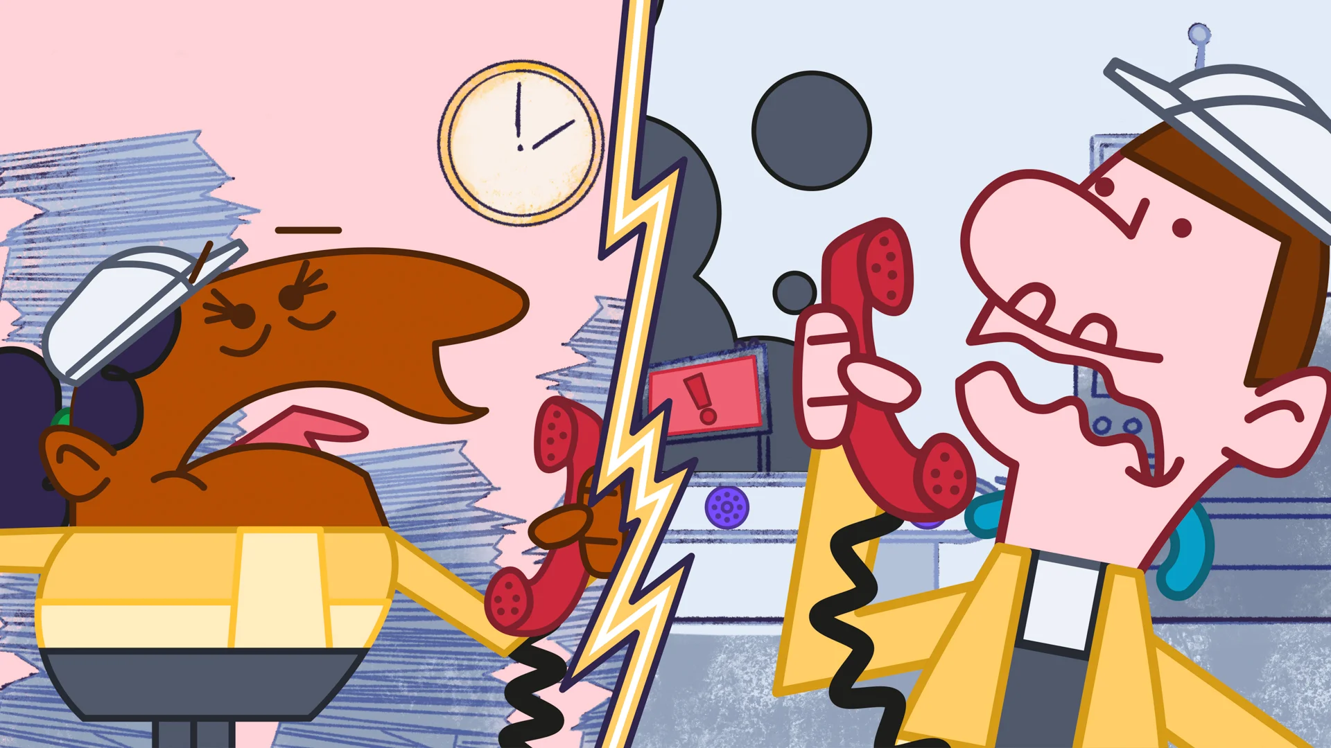
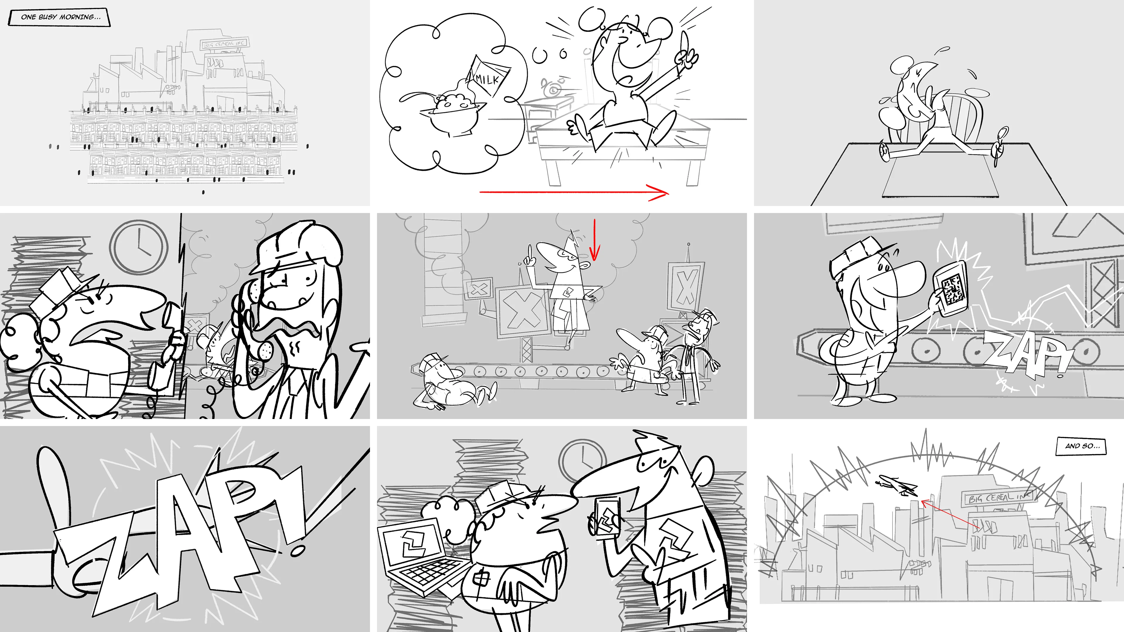
To bring the functionality to life we created a classic superhero film in a retro cartoon style. The story illustrates the effects of production lines problems, from a hungry child starting the day without her cereal to stressed out factory workers dealing with inefficiencies on the factory floor.
Brands with Character
Creating a brand character alongside a film is always fun, especially when it’s a superhero!
Captain Zaptic adds personality and character to the brand, helps to frame the product in a story and makes a complex product relatable.


Animation style
Influenced by the retro infomercial films we created an animation style that worked with the story and added to the playful feel of the film.
In keeping with the retro references we used ‘pose to pose’ and ‘squash and stretch’ styles of animation that was popular in the infomercials and Hanna-Barbera cartoons. This creates a dynamic and sometimes comic effect in the character animation.
Textures and Typography
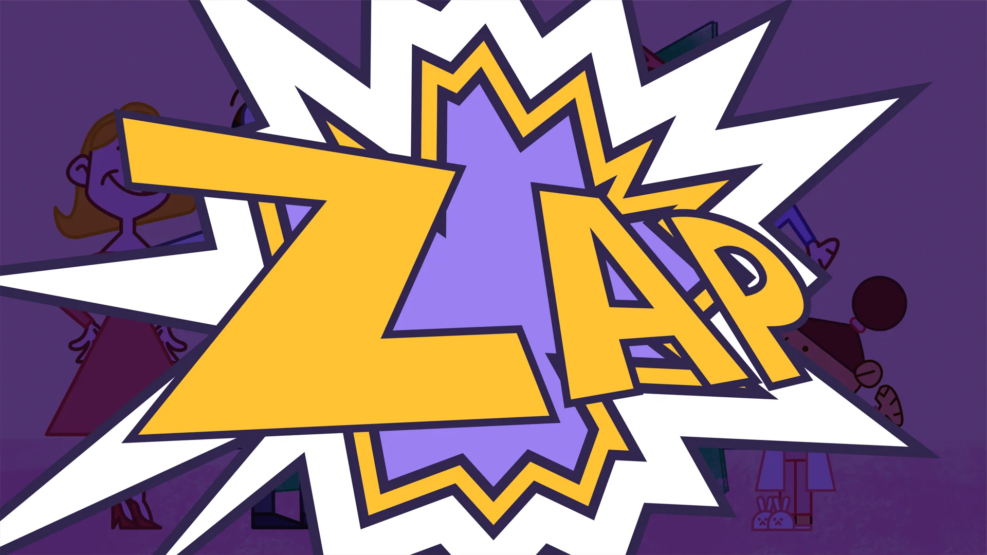
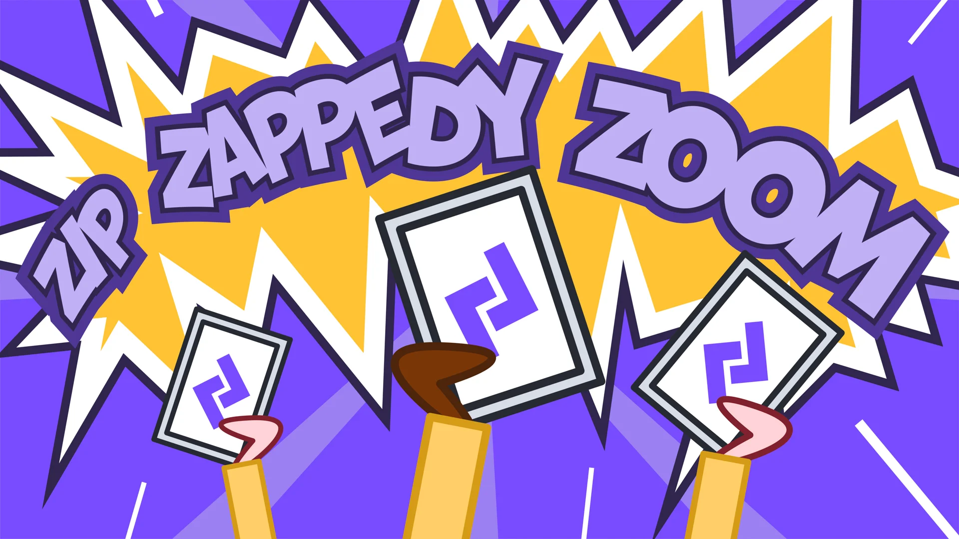
Use of textures in the artwork helps to create the retro style. Mixing in comic book influenced graphic typography adds an element of fun and impact to key moments in the film.
The result
The final film tells the story of how Zaptic helps its customers, in a way that is engaging and exciting. The Captain Zaptic character becomes an icon for the brand and a valuable asset for the company going forward.
“We approached Flow Creative as a fellow Mancunion business, plus their brand animation skills are incredible. We love Captain Zaptic and all he stands for, taking the chaos out of manufacturing and empowering factory floor teams to overcome problems and keep the wheels of industry running. Thanks Karl and the Flow team for bringing our vision to life!”
Contributors & Credits
- Creation Director: Karl Doran
- Production Management : Emma Shaw
- Script Writing : Alastair James Dickie
- Art Director: Winston Tsang, James Lawson
- Animation : Winston Tsang, James Lawson, Ines Silva
- Illlustration: James Lawson, Nadia Kawafi
- Sound Design : Rob Williamson
_(1)_-_abcdef_-_2e17ca39d5a7d786619b0b64475e4b83fbf0f60a.webp)
