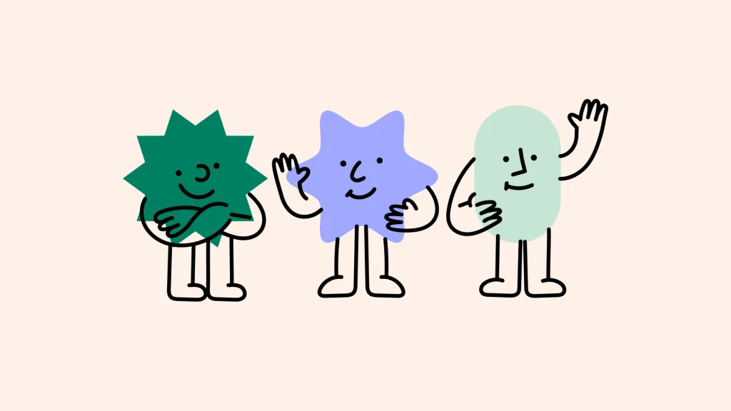
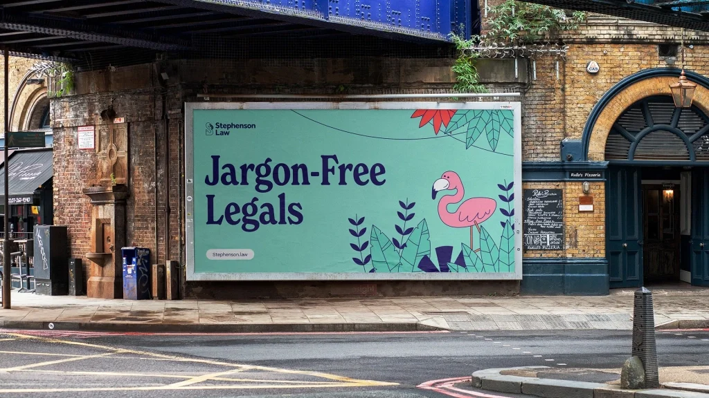
An illustration-led brand system, bursting with character and energy, for a climate conscious vehicle leasing and finance startup.
Challenge
As a newcomer to a competitive market Vavoom needed to stand out from the crowd. They needed a brand that would set them apart, show their personality and fresh approach, and help them to start to build a following.
A positive story to tell
Experts in helping people and businesses make the switch to electric cars, Vavoom are aiming to be the UKs first carbon positive vehicle leasing company. The brand identity to help tell this story and show the businesses green credentials.
A logotype with movement built in
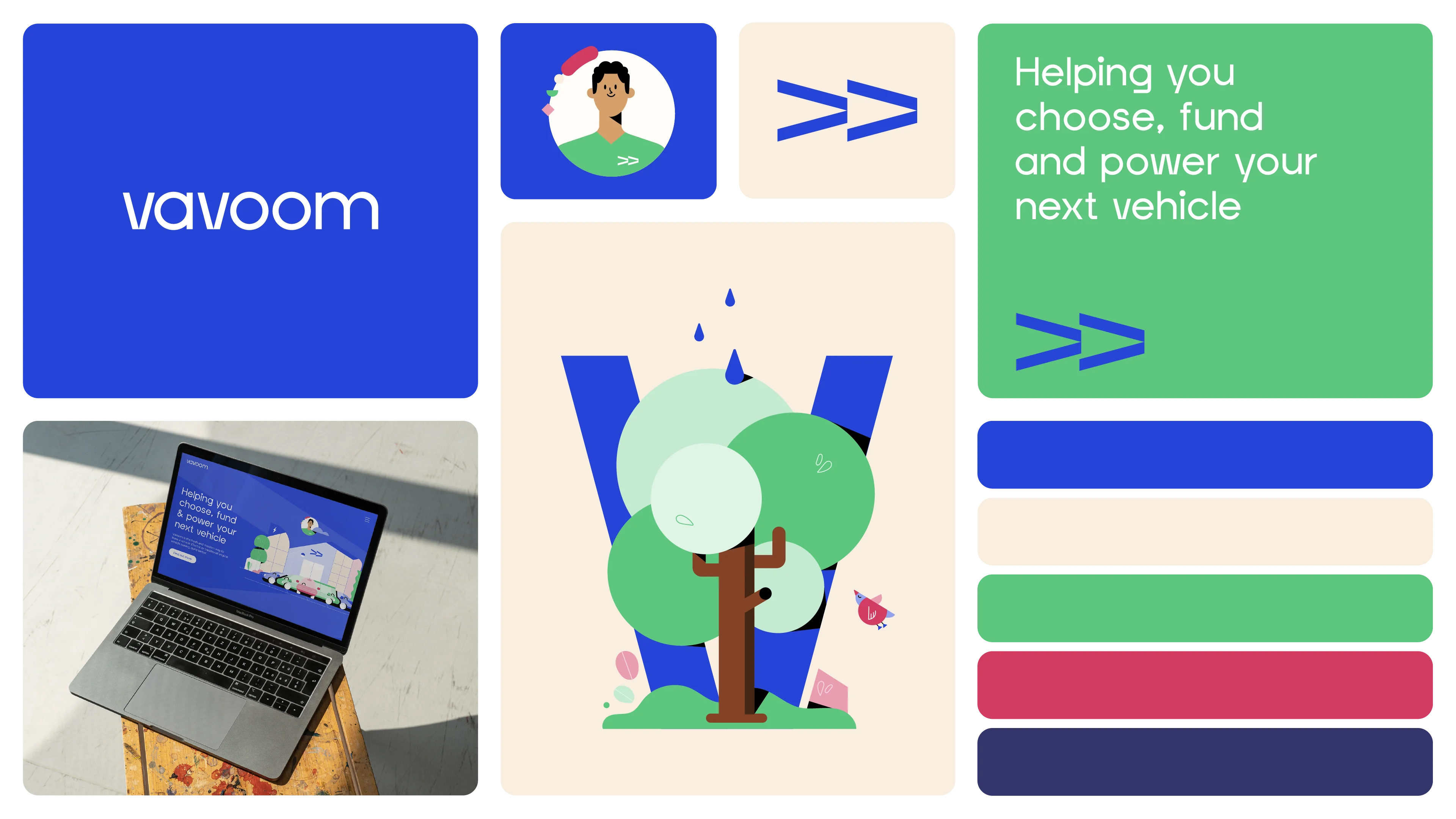
Our design for the Vavoom brand logo was inspired by the iconic Chevron road marking, giving it a dynamic and energetic feel. We customised the font to create unique characters for the Vs in the name, making the logo distinct and exclusive.
Additionally, the V can be used on its own as a holder for photography or in conjunction with the brand illustration. When animated, the logo conveys a sense of motion reminiscent of driving, but also to represent the company's forward thinking outlook.
A cohesive brand style
As a newly established startup, we had the opportunity to start from scratch. Our brand team led the Vavoom directors through a series of workshops aimed at defining the brand's personality and distinct identity.
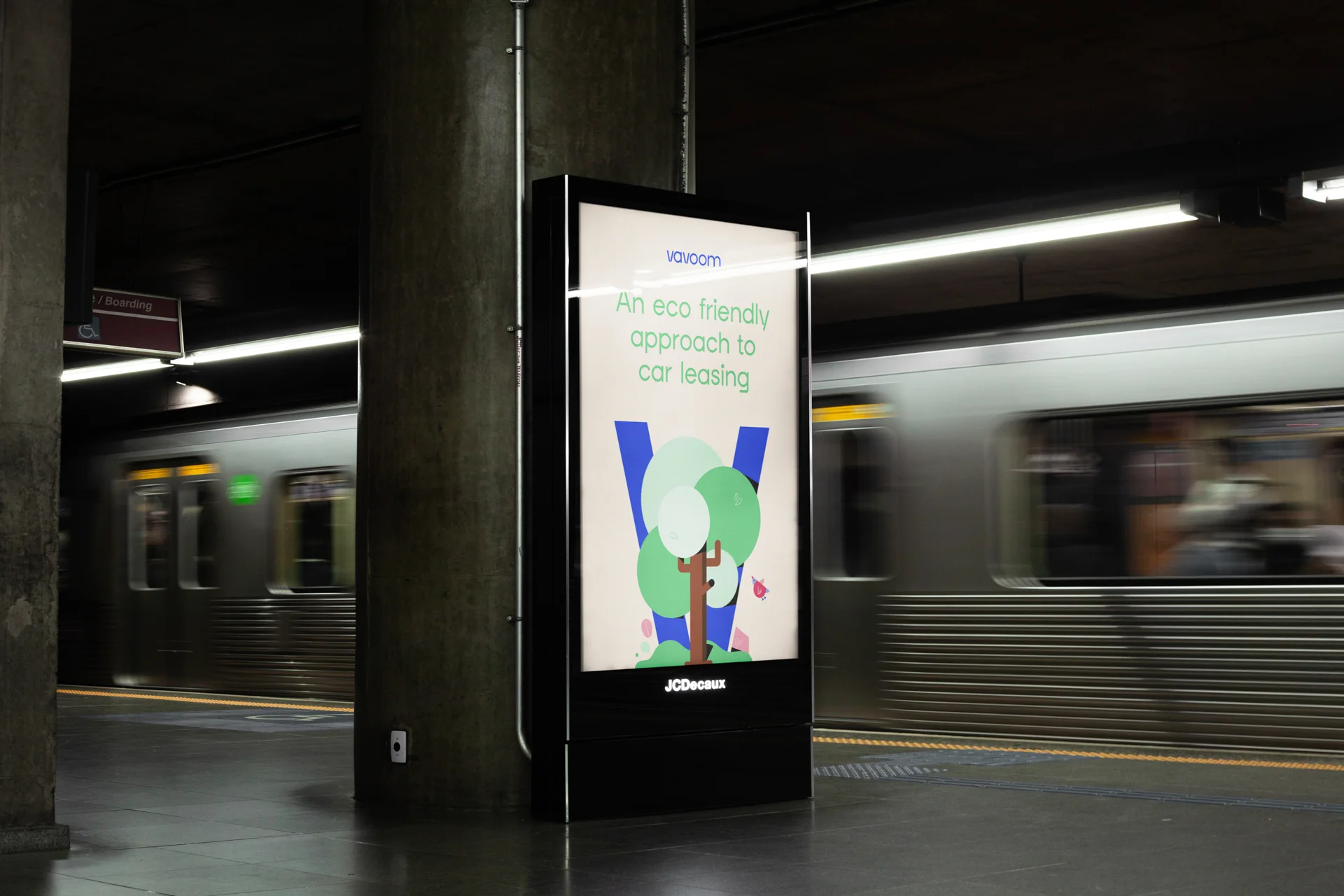
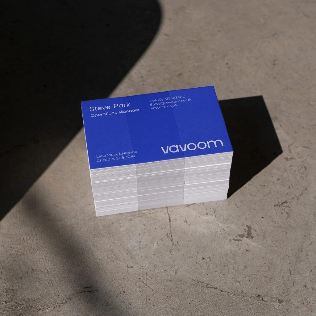
This identity is present in every aspect of the brand - from the logo-mark, colour palette, and typography to a modern and playful illustration style.
Brand launch film
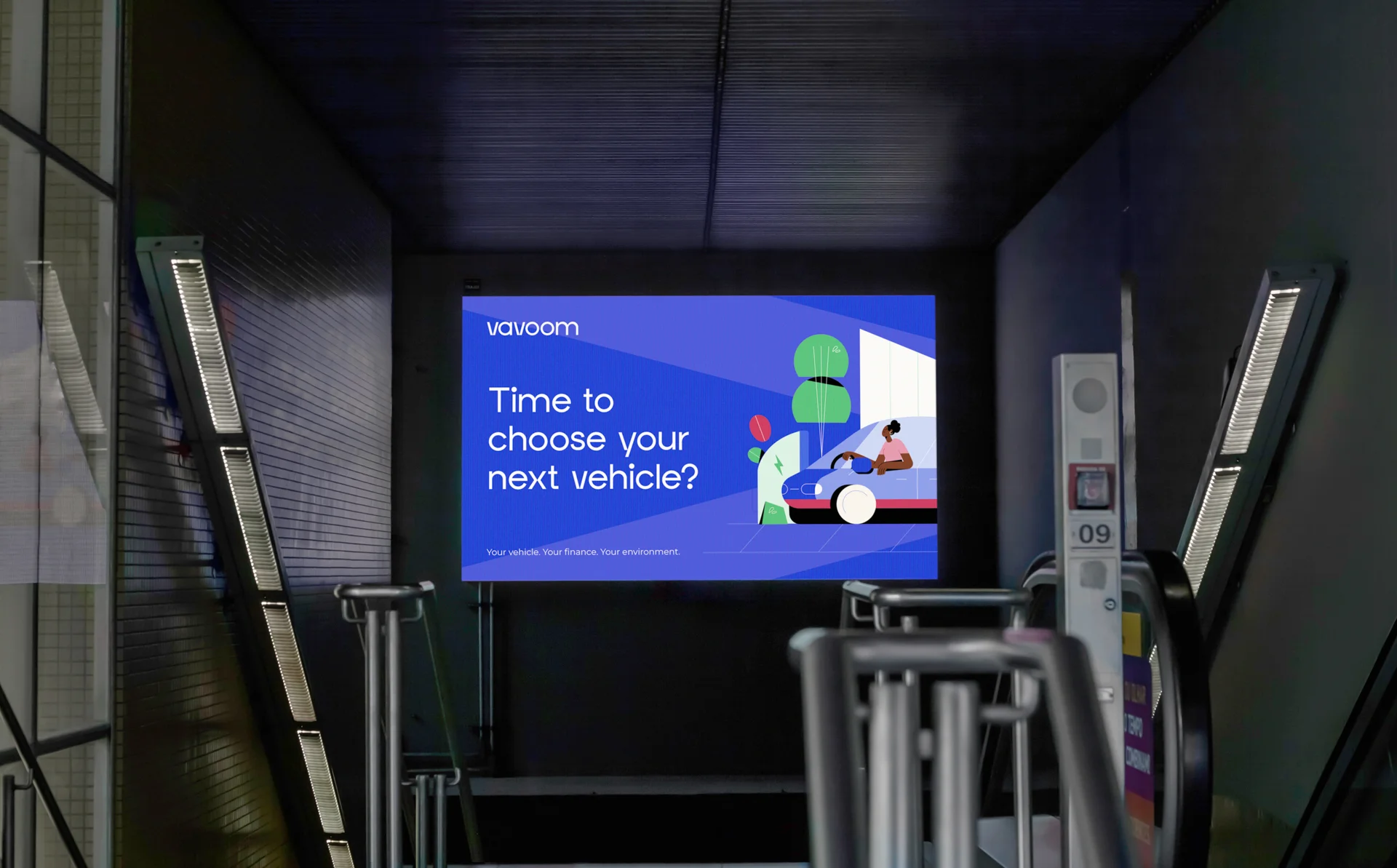
The illustration-led brand helps to add personality and character to the brand, giving it a universal appeal to a wide audience.
It's also perfect for animating! As part of the brand launch we also created an animated launch film to help get the brand moving, and to showcase their unique perspective and tone of voice.
Dynamic branding
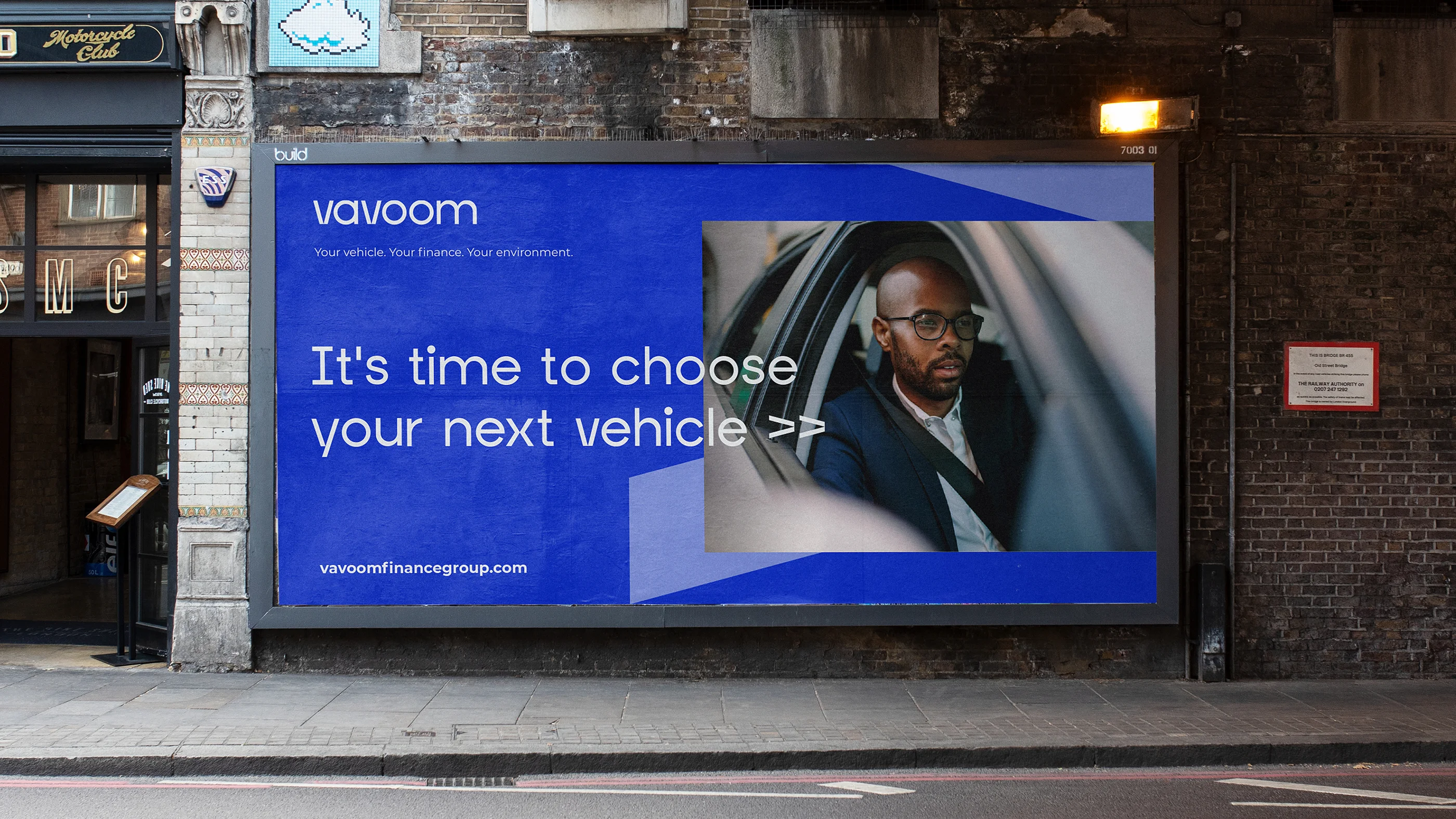
We tired to get as much movement as possible into the branding in order to distinguish Vavoom from its competitors and convey the energetic and lively nature of the company.
They are here to get their clients moving, but also to help move the industry and the world forward. The sleek brand typeface, dynamic logo-mark, motion-led illustration and photography style all work together to achieve this.
Colour palette
The fresh and contemporary colour palette helps the brand to feel vibrant and exciting, and appeal to a brand customer base from enterprise level fleet customers to individuals looking to switch to EV.
Illustration style
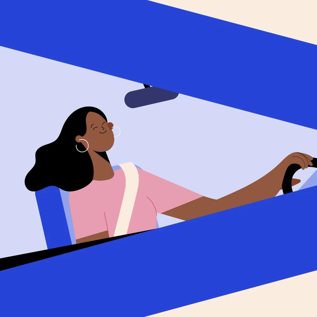
The Vavoom team strive to offer their customers an exceptional experience by being approachable and easy to work with. To reflect this in the brand identity, we developed an illustration system that is brimming with personality and character.
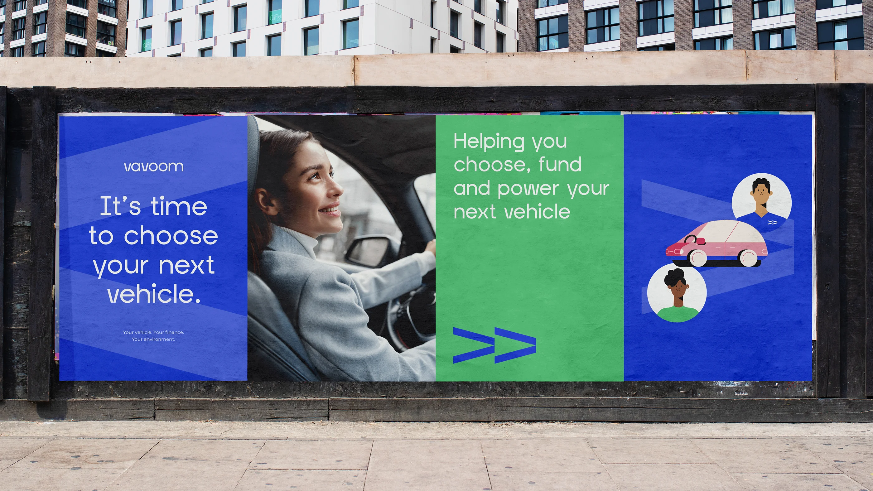
This approach not only helps new brands to establish their presence in a highly corporate environment but also ensures that customers can visualise what they're getting from our product-led services. We carefully balanced the use of illustrations and photography and created a set of holding devices for imagery to maintain this balance while staying true to our brand style.
Fresh and energetic
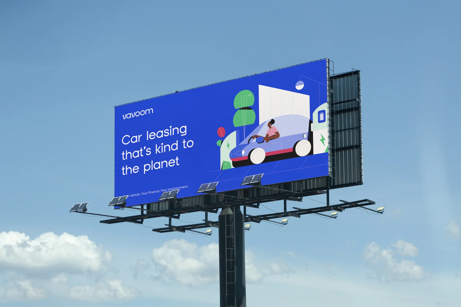
Vavoom have a unique attitude in the leasing industry that exudes energy and positivity, setting them apart from their competitors.
We helped them to develop this into a distinct brand tone of voice enabling them to establish a clear point of difference and gain recognition.
Since then, Vavoom has become a major player in the vehicle leasing industry and a pioneer in promoting the use of electric vehicles.


The result
The distinctive brand style has helped Vavoom to have a clear positioning and point of difference in a busy sector. All aspects of the brand work seamlessly together creating a strong and individual tone of voice, making it very clear why they are the obvious choice for any vehicle leasing needs.
“The team at Flow were great to work with, they really took the time to get to know us and learn what was important to us as a business, whilst conveying what is different about Vavoom for our customers. The result is a modern brand and animation that we’re super proud of - it represents our values and the vision for the brand moving forwards”
Contributors & Credits
- Creative Director: Karl Doran
- Design: Josh Taylor
- Illustrator: Bulma Juozaityte
- Animator: Jordan Painter, Winston Tsang, Inês Silva
- Producer : Chelsea Tantum
