A bold and characterful new brand and website for a team of legal game changers.
Challenge
Stephenson Law, a legal firm in Bristol, faced a challenge: their brand did not align with their dynamic and inclusive business personality. The brand appeared outdated, inconsistent, and failed to convey their creativity and innovation. Our task was to create a brand that better fit the progressive business.
Brand strategy
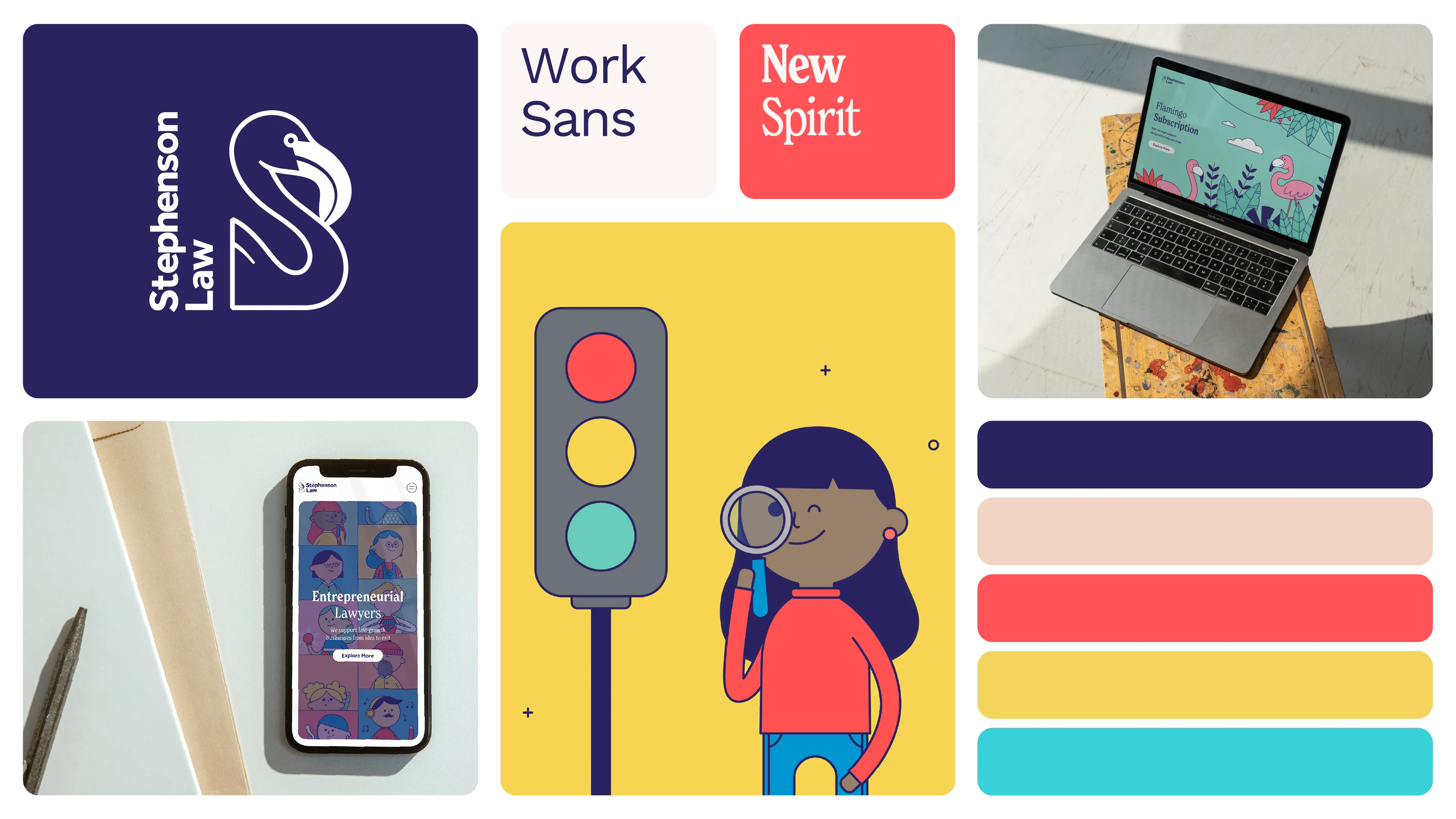
Through a process of brand workshops with their marketing and leadership teams, we helped to uncover and define the brand character, the businesses unique personality and tone of voice.
This essential step informed the brand's communication style, storytelling approach, and overall perception by its audience. The brand character work established a foundation for an authentic brand that aligns with their creative and energetic nature, enabling them to stand out from competitors and speak with an authentic voice.
Brand design
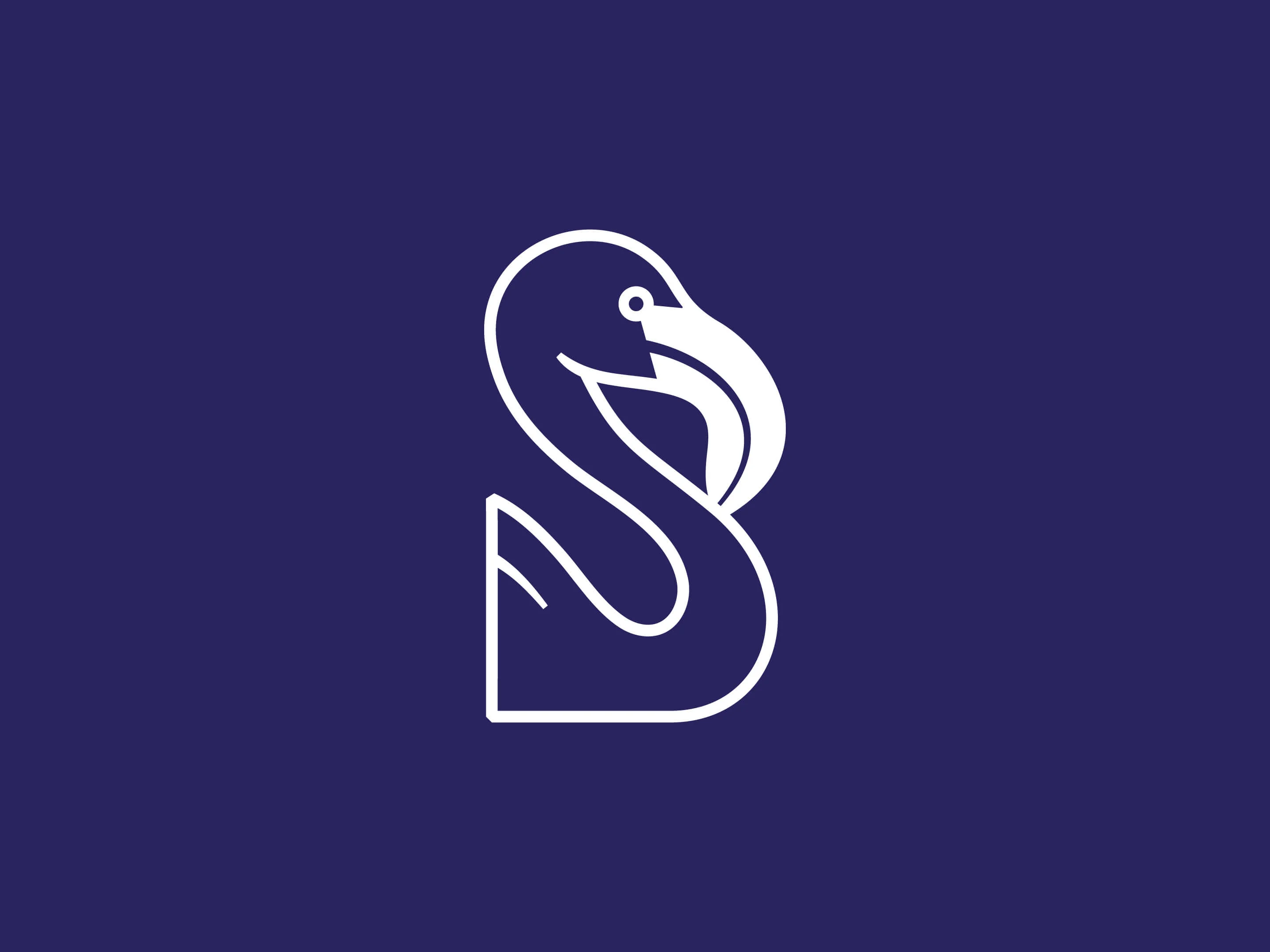
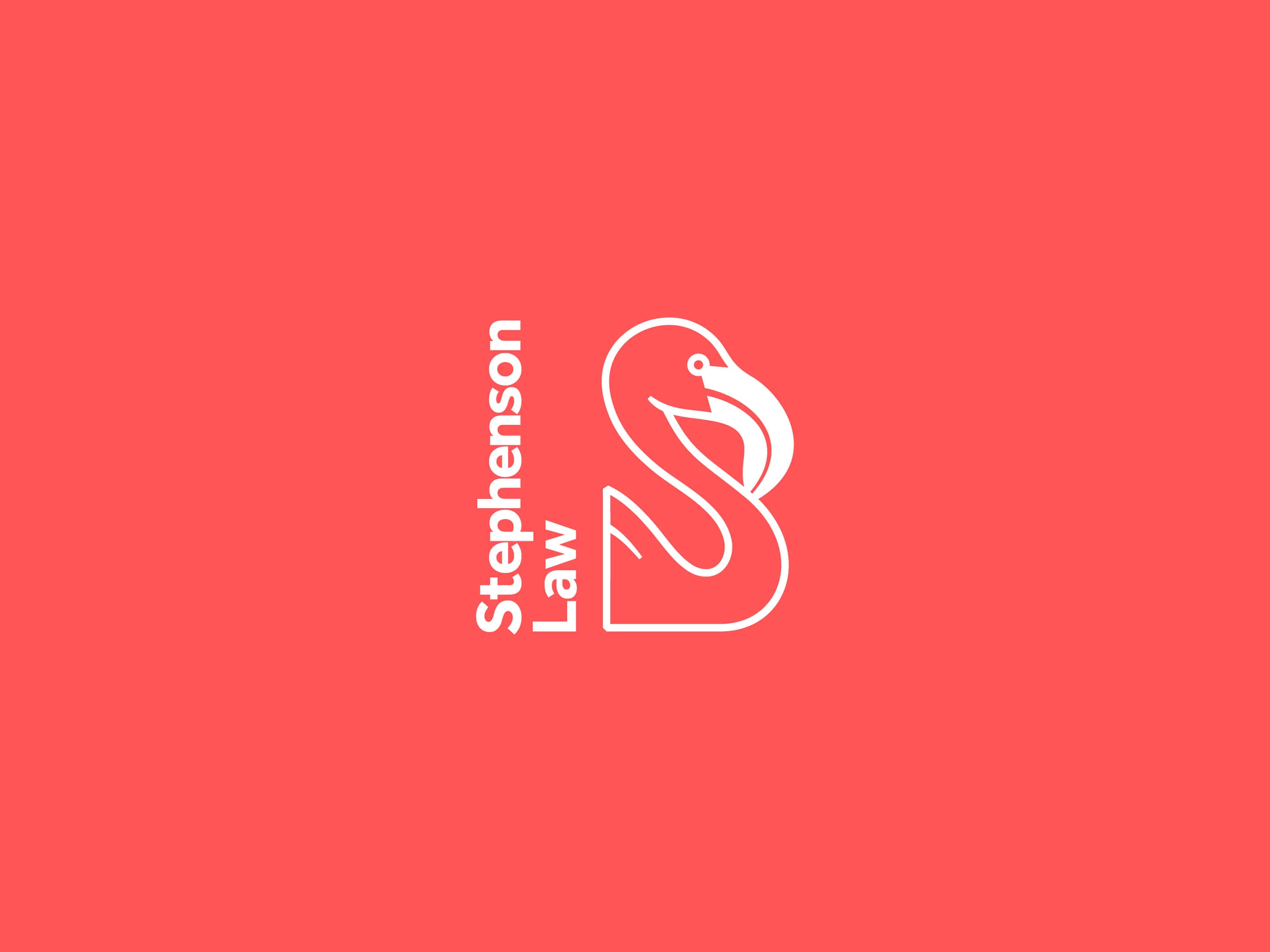
The brand had a logo featuring a flamingo, but it didn't quite fit the brand's tone of voice and felt a bit stuffy. To address this, we designed a new, more playful logo that incorporated the bird's neck to form the letter S in the brand name.
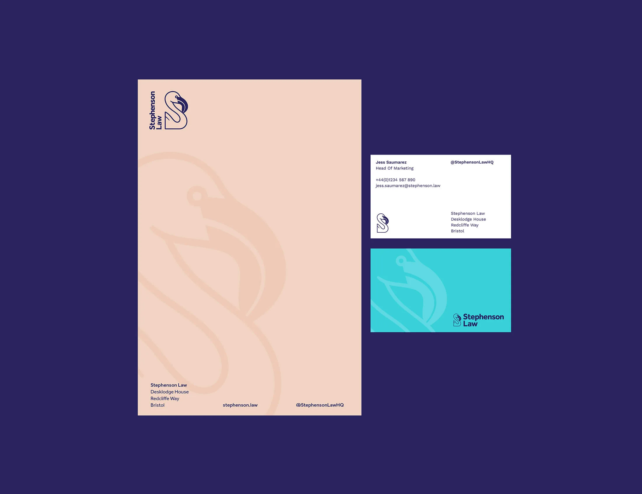
We also created a versatile set of type lockups and a vibrant colour palette to better represent the team's diversity and energy. To complete the brand essentials update, we selected some more modern typefaces for the brand typography.
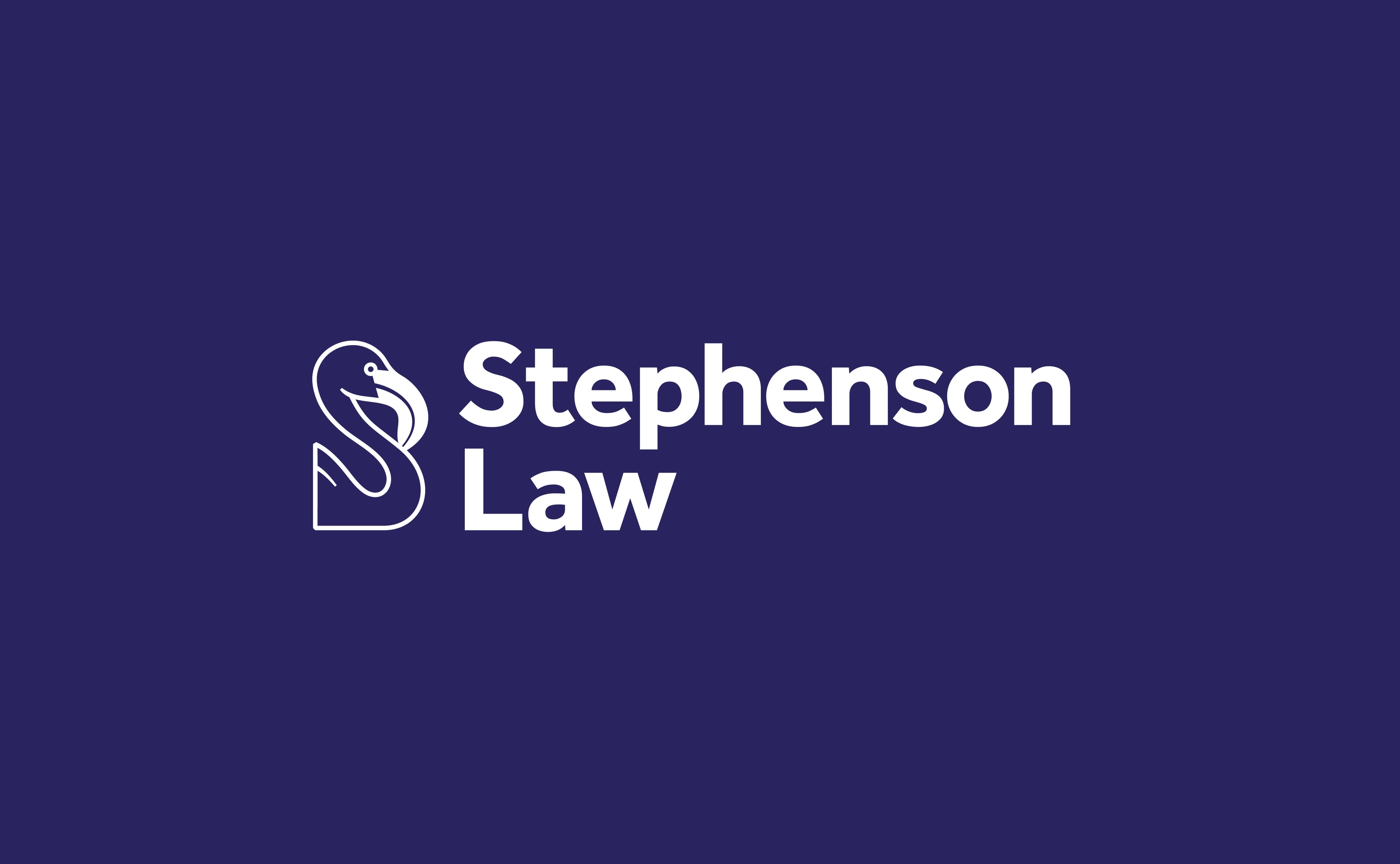
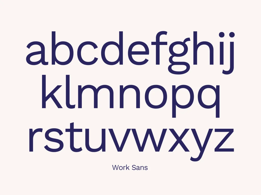

Illustration style
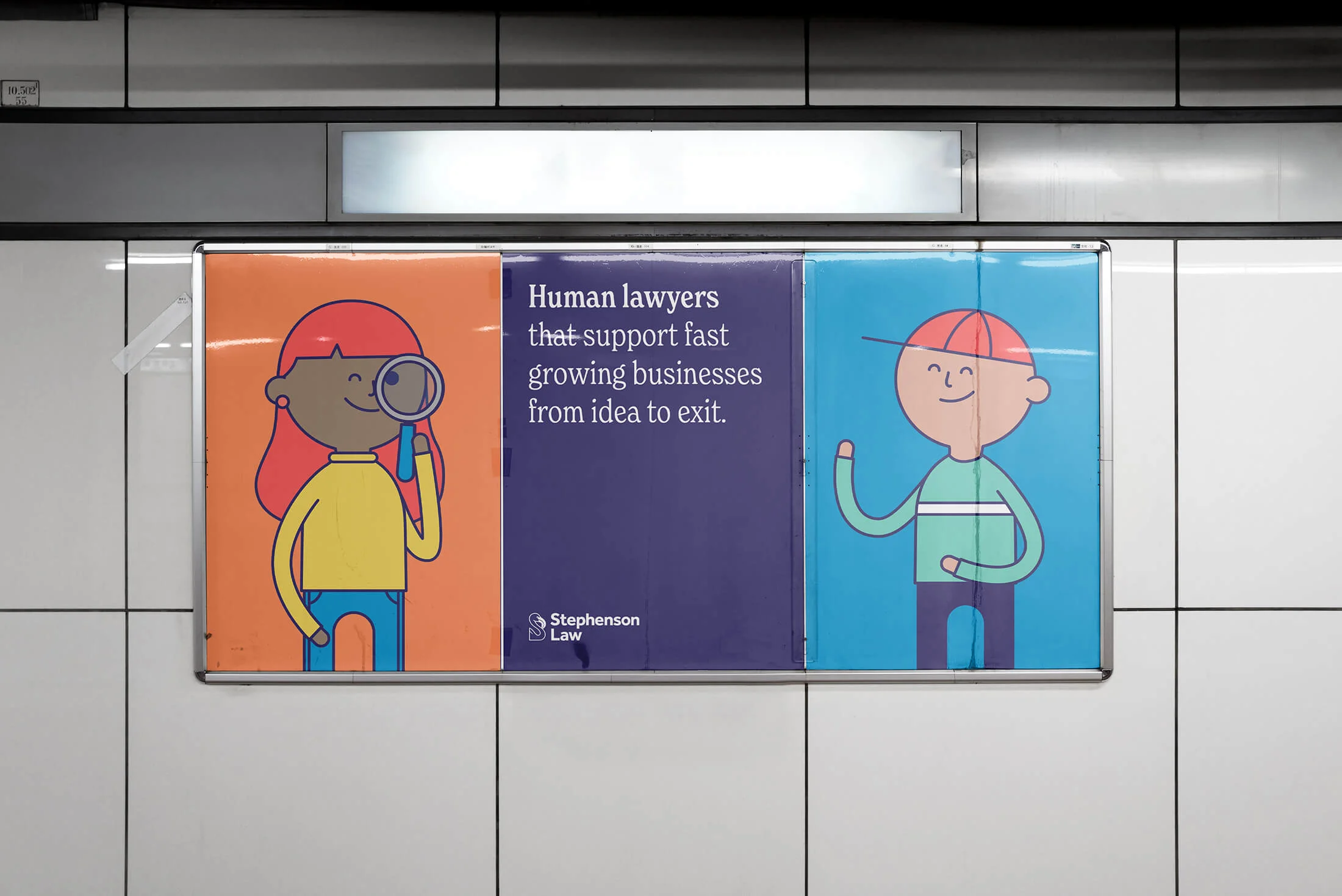
The previous brand used a lot of illustration, which helped it to stand out from its competitors. However, the outdated and low-quality style was negatively affecting how the brand was perceived.
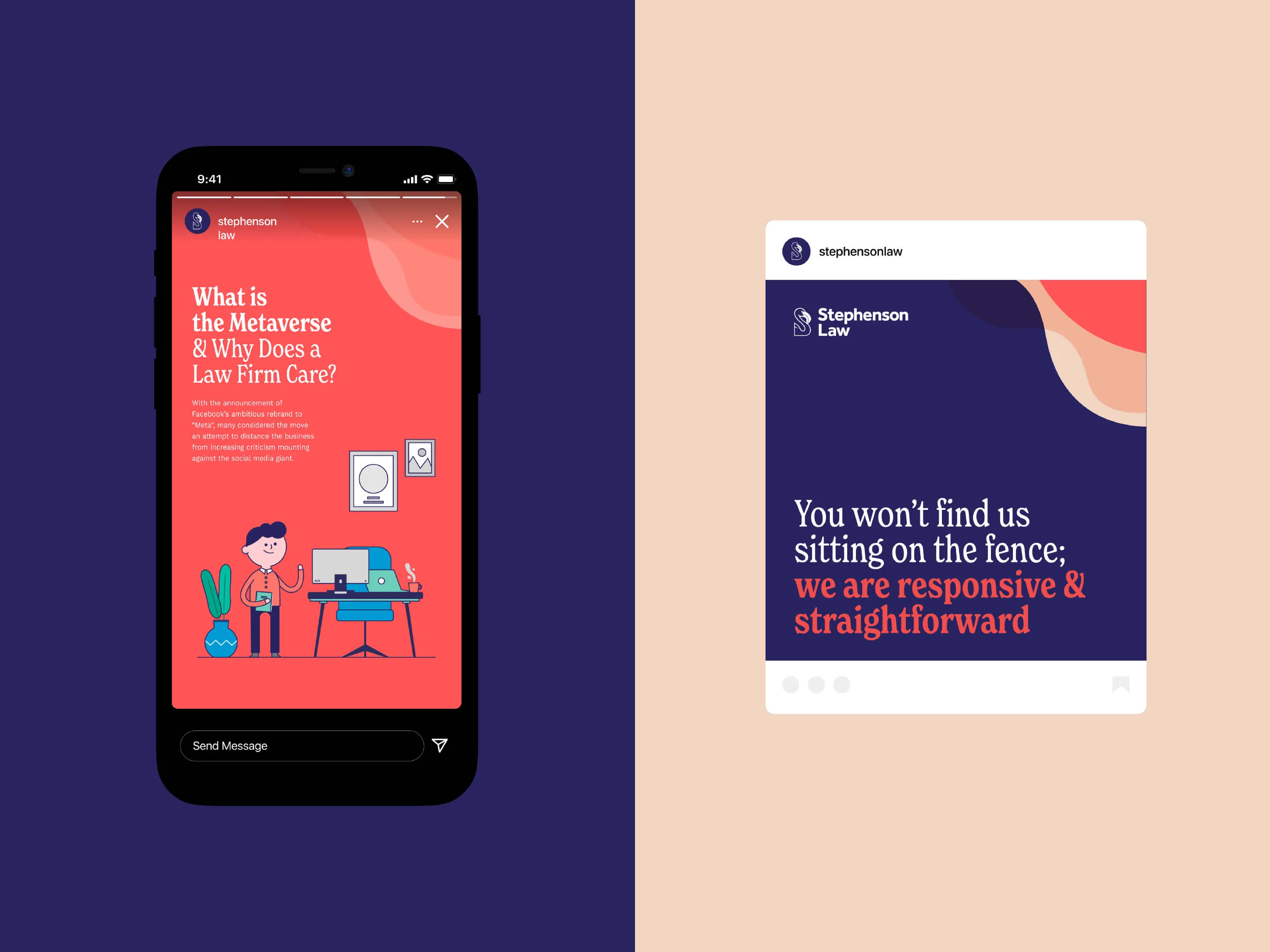
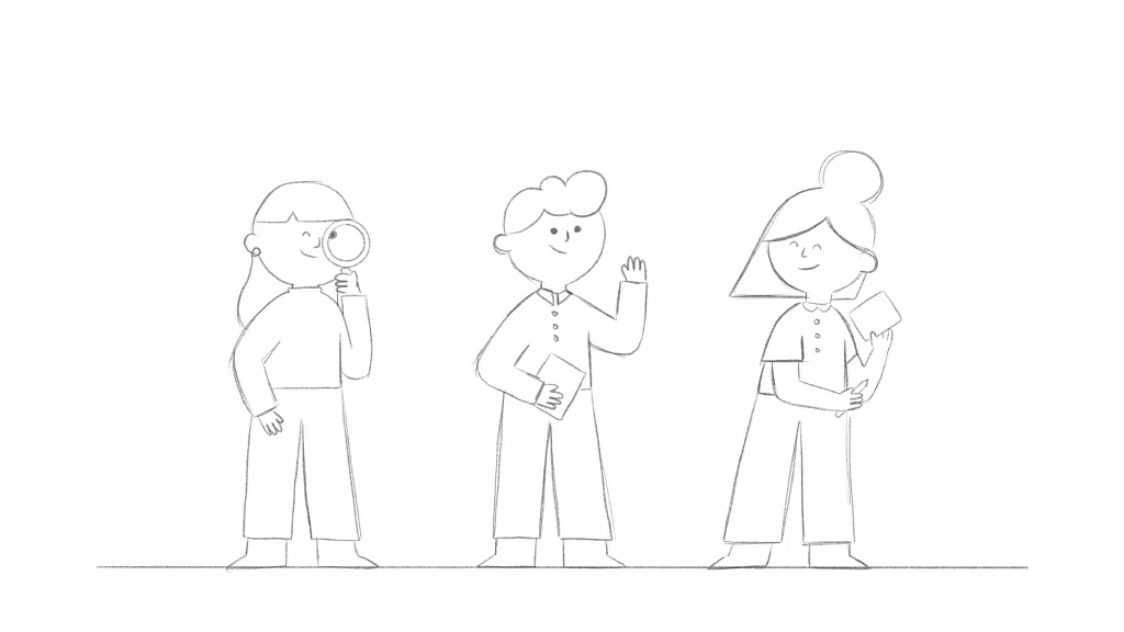
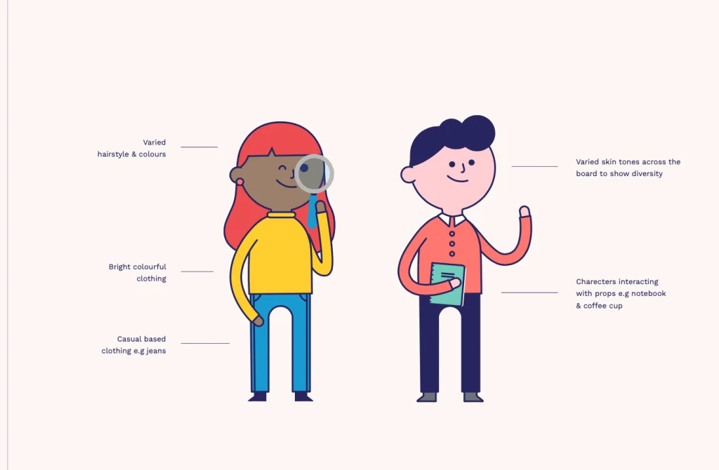
To bring the brand up to date we developed a contemporary illustration system that not only made the brand feel modern, but also added a friendly and accessible personality.


Bringing the character to life
Of course, we couldn't resist animating these little guys! With a brand that is so character-led it's a really effective way to add a bit more personality and energy to the website and all brand communications.
Site Design
How a brand is applied is as important as the brand elements themselves. The website for Stephenson Law is their place to showcase what they do, but also to get across their personality and culture, and a sense of what it's like towork with them.
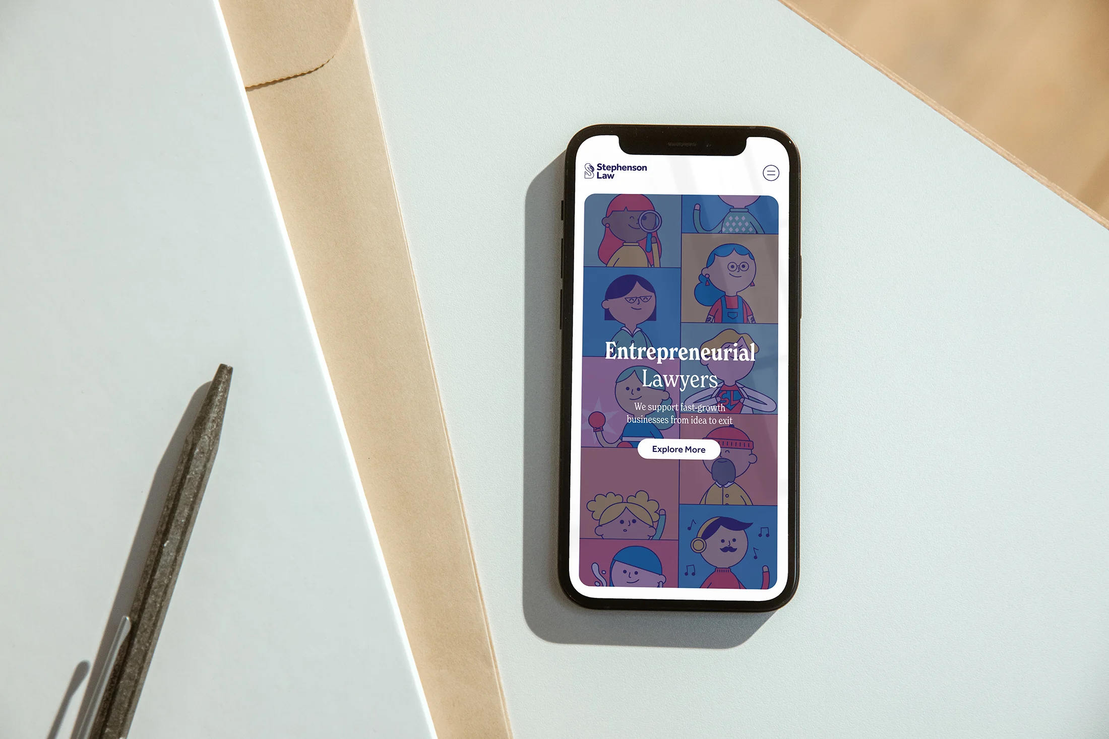
We designed a comprehensive new website to showcase the new brand, with lots of playful touches that add to the sense of authenticity and ownership of the brand.
The Result
The result is a brand that the Stephenson Law team can be proud of, that reflects the character of the business, and helps them to communicate better with their audience.
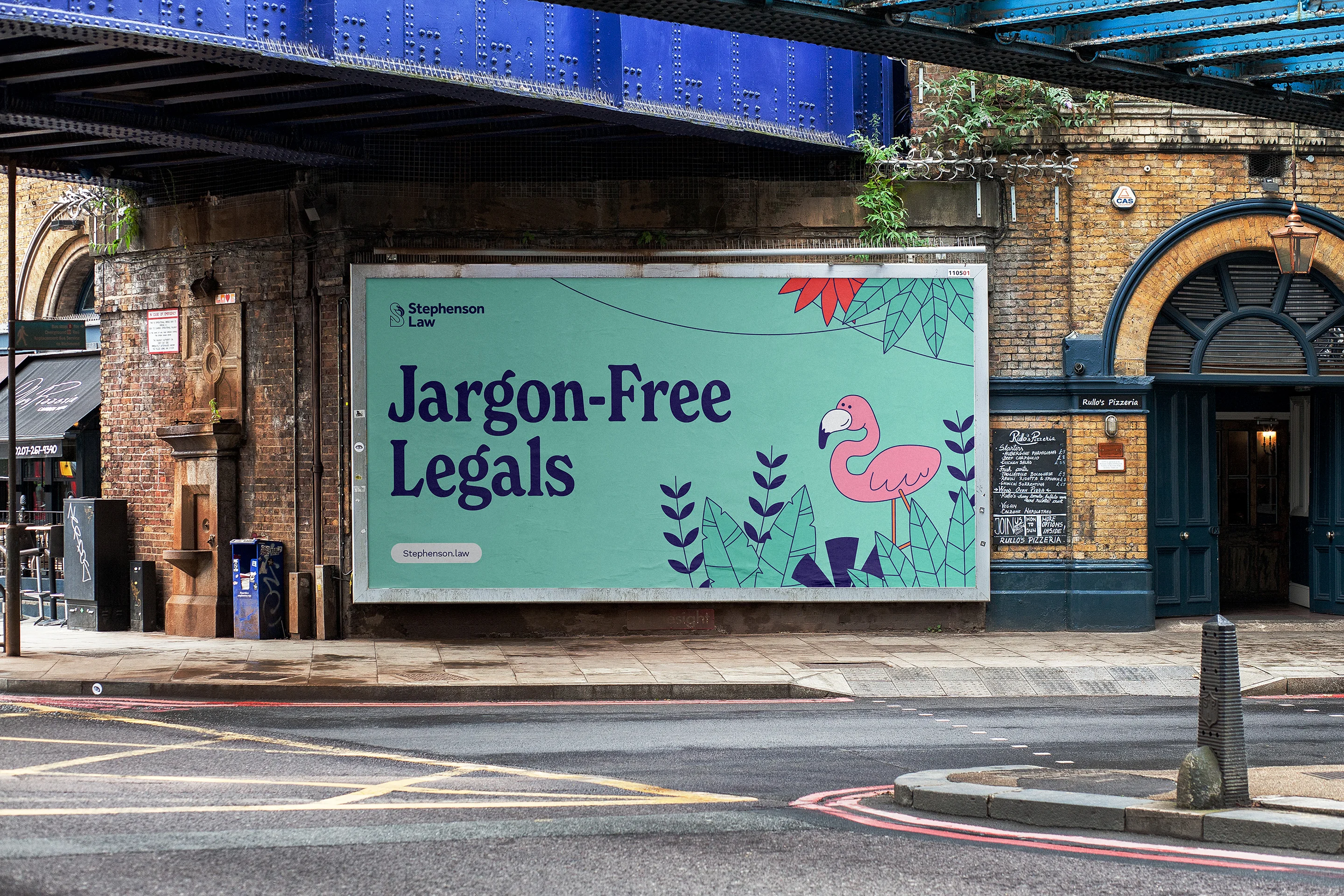
Across all brand touchpoints it is now clear who the company is, what their character is and who they are for.
Who says corporate brands have to be boring?!
"We love the new brand, it's bold and colourful, full of character and personality and represents the culture of the company, which looking back, the old brand definitely didn't!"
Contributors & Credits
- Creative Direction : Karl Doran
- Design : Dave Sedgewick, Josh Taylor
- Illustration : Guy McKinley, Elena González Sánchez
- Animation : Inês Silva, James Lawson
- Production : Chelsea Tantum
- Web Development: Daniel Parker
