A hugely ambitious global campaign, aiming to unite nations around the world in signing a treaty that will put an end to the plastic pollution crisis, by addressing its root cause. To End the Age of Plastic.
Challenge
Greenpeace required a distinctive brand identity for their vital campaign, with the aim of reaching a worldwide audience and inspiring the necessary change for our planet. The branding had to be iconic, easily identifiable, and have a global impact.
An ambitious goal
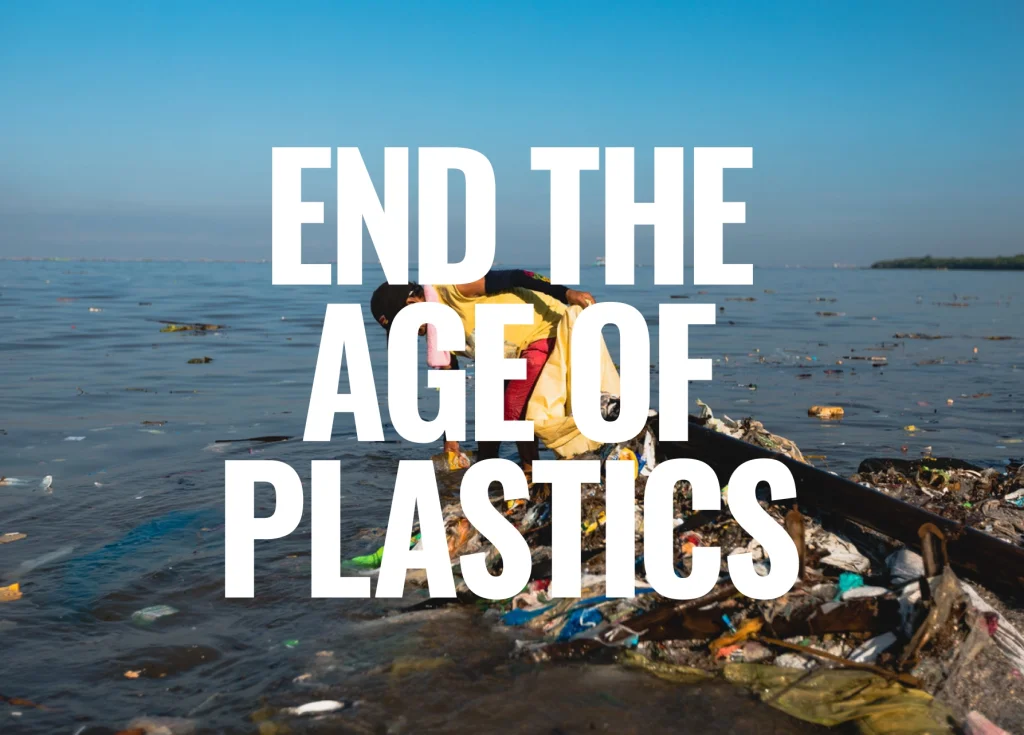
The prevalence of plastic in our world is alarming as it causes harm to the environment, human health, and contributes to social injustice. It is a major contributor to the climate crisis and the loss of biodiversity.
The objective of this campaign is to promote the adoption of a legally binding agreement among nations to eliminate plastic pollution throughout its entire life cycle, thus safeguarding the environment and human well-being.
A clear and powerful message
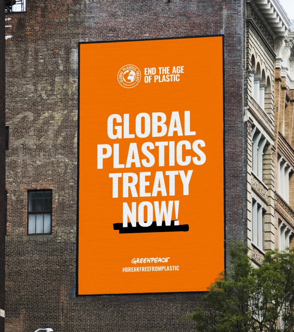
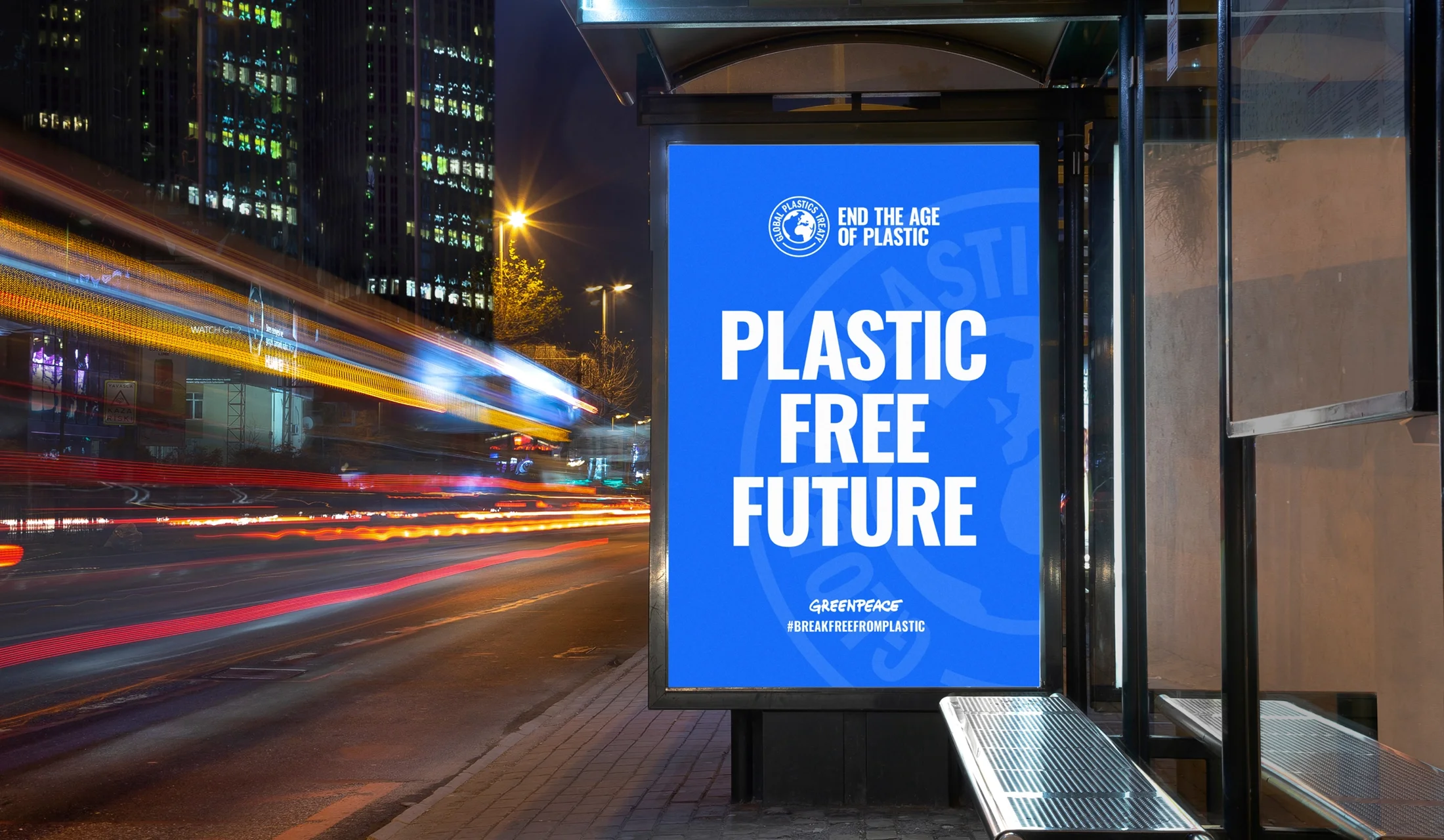
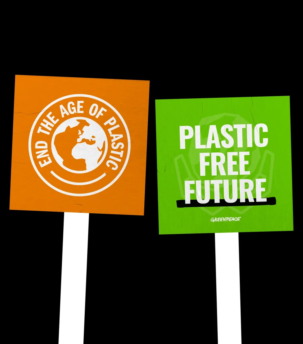
The campaign is inspired by the visual language of activism and features a low-fi, do-it-yourself aesthetic.
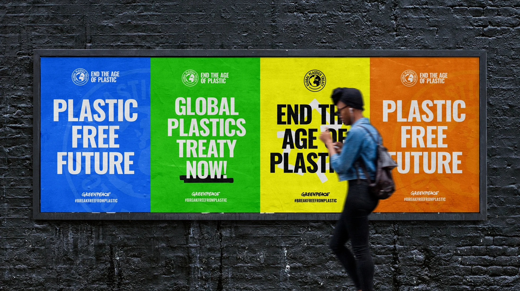
The goal is to create an empowering movement that people worldwide can support to encourage their leaders to sign the treaty. The simple but striking look of the campaign helps to deliver a powerful message - that the time for change is now.
Iconography
We created an icon set for the campaign that leans into the activism aesthetic by using a handmade, cut-out graphic style.
Clarity and impact were the main considerations in the icon design. The icons would be used by Greenpeace offices worldwide in multiple languages, so needed universal legibility and instant impact.
Campaign messaging
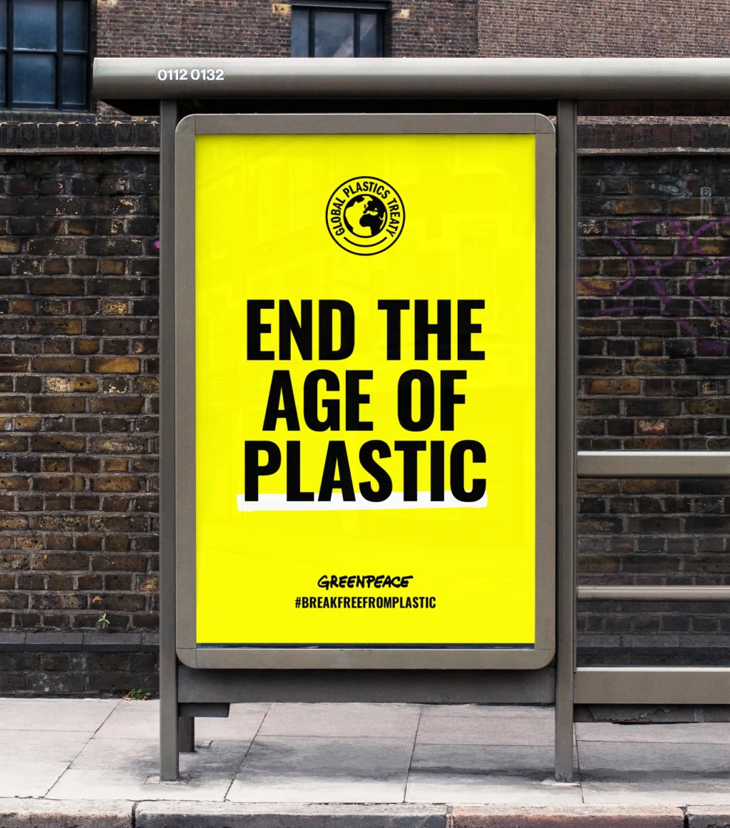
As part of the campaign, the messaging utilised a robust typography style that caught the eye. However, the messaging was kept simple enough to allow for easy translation into various languages for global use.
A badge of honour
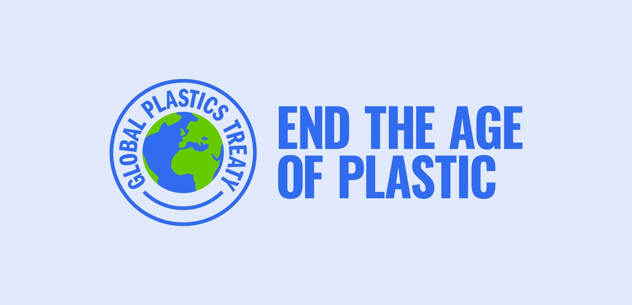
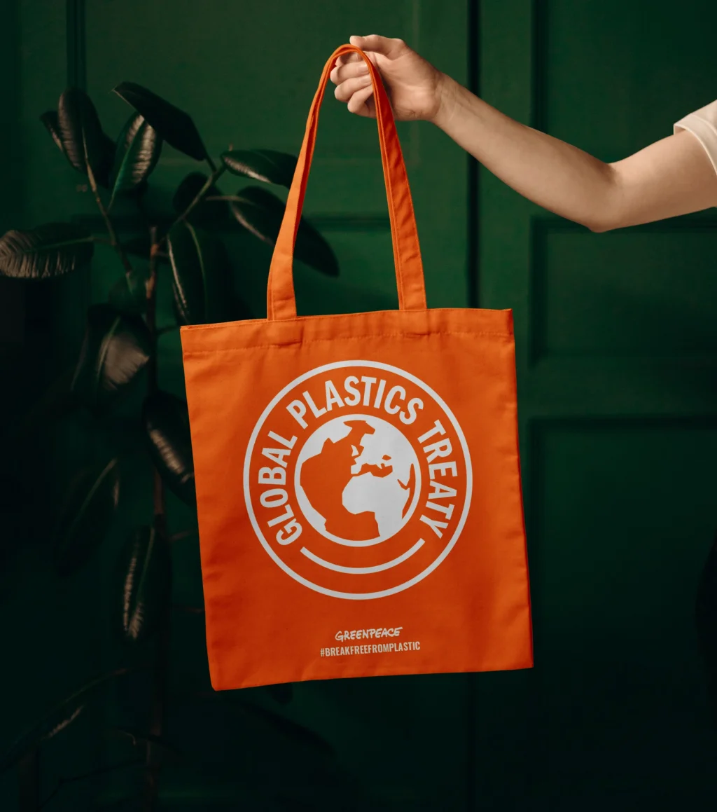
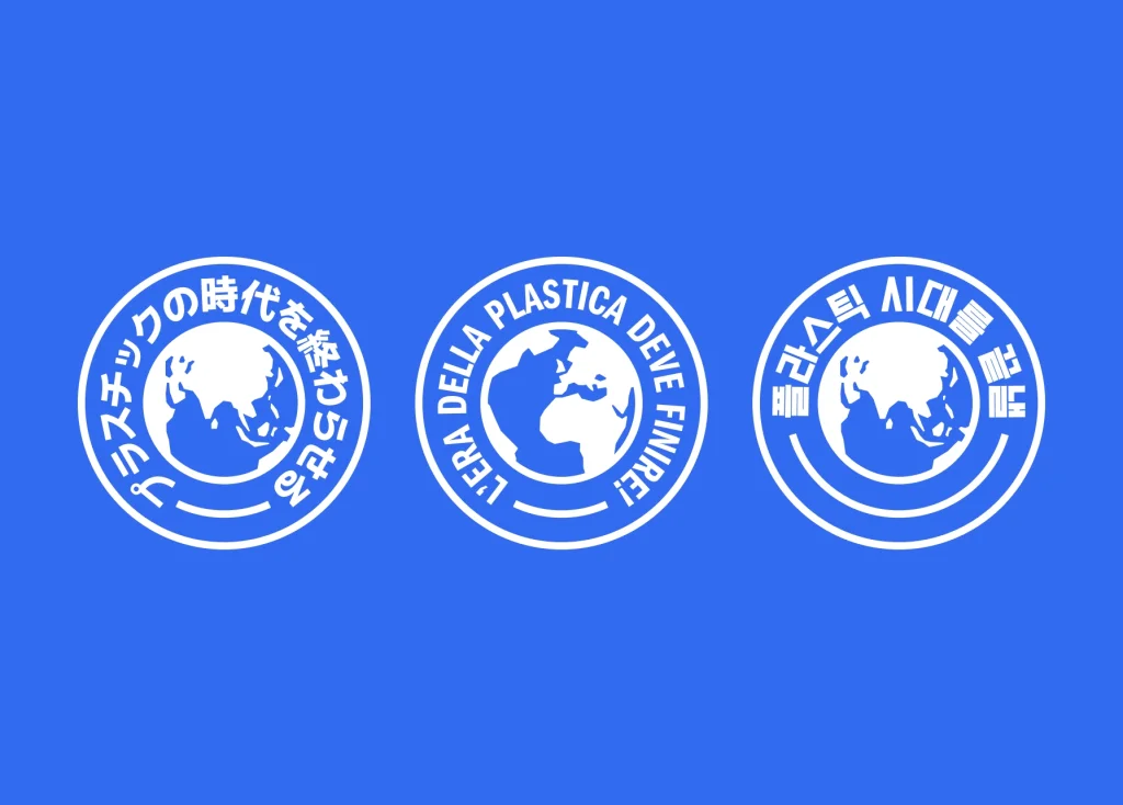
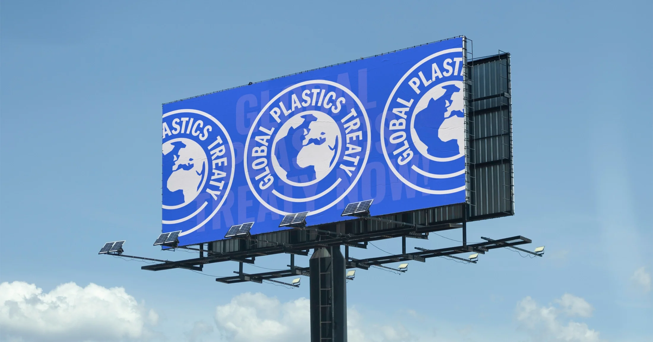
In order to ensure that the message of the campaign is easily comprehensible, a straightforward stamp mark has been created for use by all Greenpeace offices dedicated to addressing the crisis of plastic pollution.
The design of the logomark is centred around the concept of a badge of distinction that indicates membership of the treaty and features a visual representation of the globe.
Four distinct versions of the logomark have been developed, with each one highlighting a different continent of the planet. This approach enables Greenpeace offices across the globe to have a regional sense of ownership over their respective logomarks.
Brand Development
In close collaboration with multiple European and US-based Greenpeace teams, we created a branding system for the treaty that effectively promoted the campaign to the global news media and a worldwide audience. Our iterative process led us to a visual style that effectively conveyed the message and urgency of the cause.
The result
The campaign has been making waves globally and has helped Greenpeace to capture the attention of political leaders, the news media and the general public worldwide.
The visual impact of the campaign branding has helped it to cut through the noise and reach a huge audience with clarity and purpose. We really hope the campaign will be successful and are proud to have been able to help with it.
“Massive thanks to the team at Flow for creating such an empowering brand identity for our Global Plastics Treaty Campaign. We needed an identity that worked internationally, that would grab our audience’s attention and that evokes hope and ultimately urgency for action. We are delighted with the outcome and are excited as it comes to live globally.”
Contributors & Credits
- Creative Director : Karl Doran
- Design: Josh Taylor
- Illustration: Nadia Kawafi
- Motion Design: Matt Volp
