A joyful and characterful brand system for Bolton Family Hubs
Challenge
The Bolton Family Hubs Program is a transformative initiative designed to provide integrated and coordinated support to families with children aged 0-19, and up to 25 for those with special educational needs and disabilities (SEND). The challenge was to create a brand that would embody the program's inclusive, community-driven ethos, ensuring it appeals to a broad demographic while avoiding any stigmatisation. The brand needed to be playful yet professional, accessible, and characterful, reflecting the vibrant diversity of Bolton’s families. Our goal was to develop a brand system that would work for the whole community of Bolton, and empower families to access the support they need.
A brand filled with joy
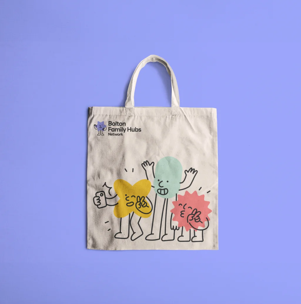
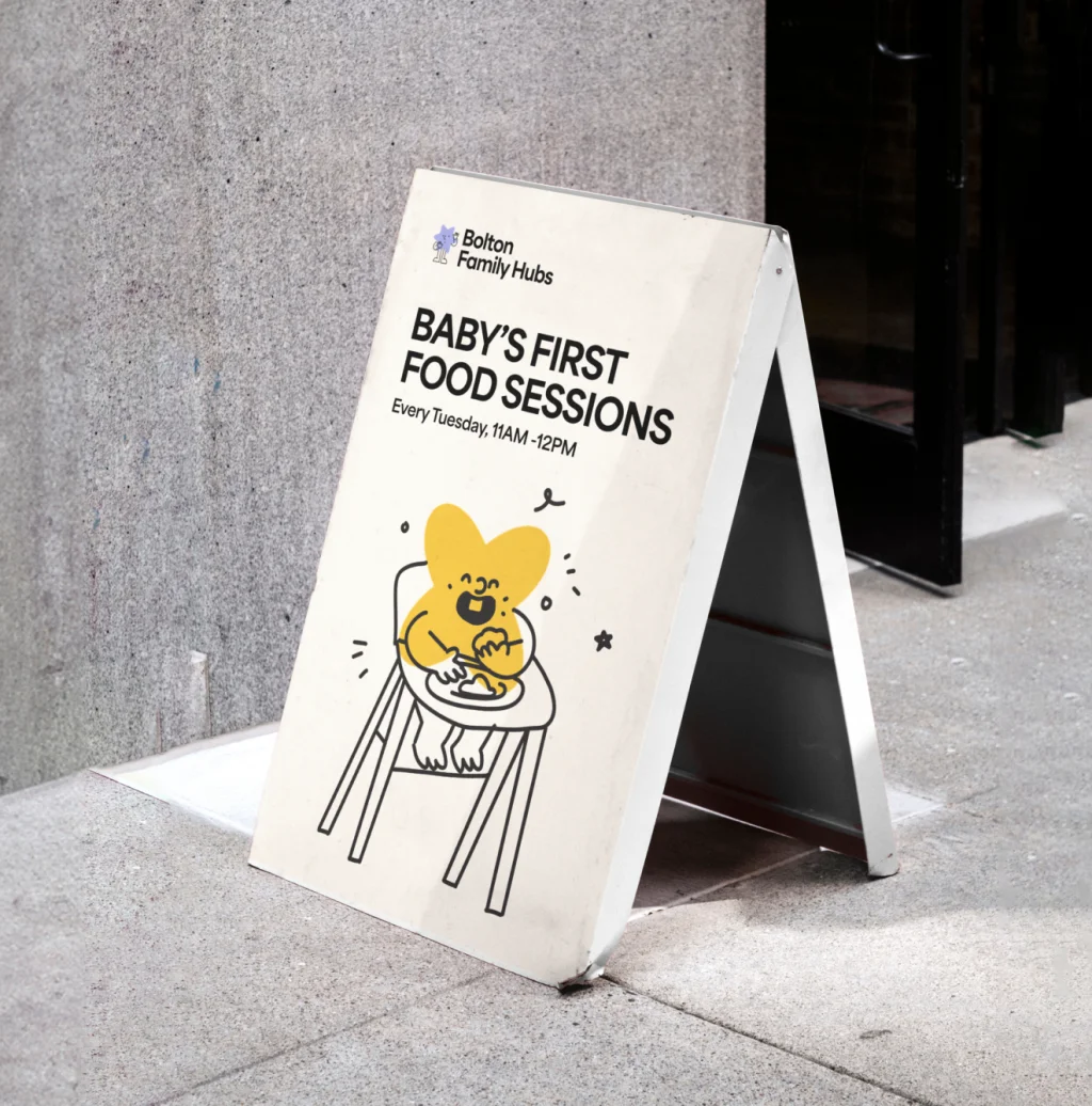
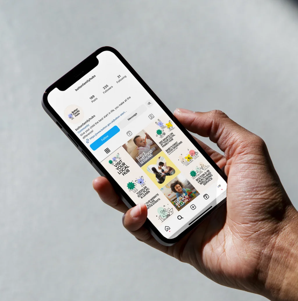
Bolton Family Hubs needed a lively and engaging identity that would resonate with families in the area. The brand is filled with playful energy and character, designed to be welcoming and approachable for all age groups. The family hubs are a vital source of support for the whole community of Bolton. The brand was designed to be as inclusive as possible so everyone felt welcome, and to encourage as many people as possible to access the help they need.
Type mark
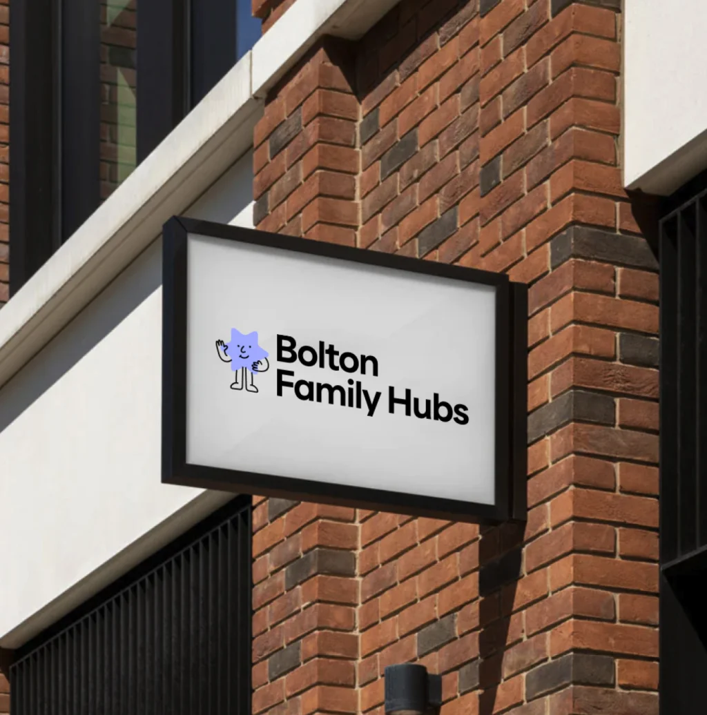
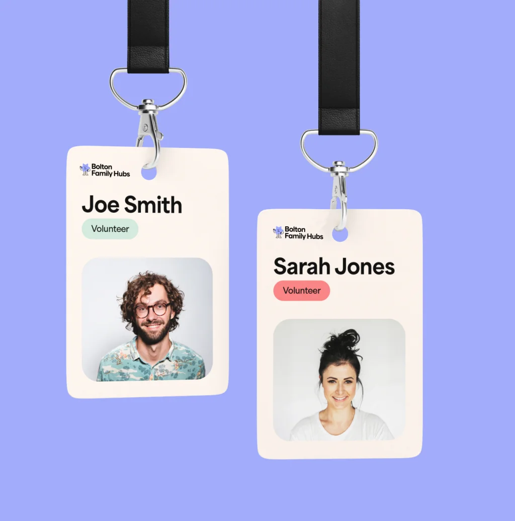
The type mark for Bolton Family Hubs is both friendly and modern, reflecting the program's forward-thinking approach. A friendly character illustration paired with a modern sans serif that is easily readable across various media, ensuring accessibility for all users, including those with visual impairments. The type mark is complemented by subtle character elements that tie back to the brand’s playful nature, making it both distinctive and relatable.
Brand Development
Our brand development process was deeply collaborative, involving multiple stakeholders to ensure the final brand would meet the needs of Bolton's diverse communities. We began with in-depth research into the local demographics, existing support services, and the specific challenges faced by families in the region. From there, we developed a series of concepts, each centered around the idea of inclusivity and community support. Through focus groups and stakeholder feedback, we refined these concepts into a cohesive brand system that aligns perfectly with the Bolton Family Hubs’ mission.

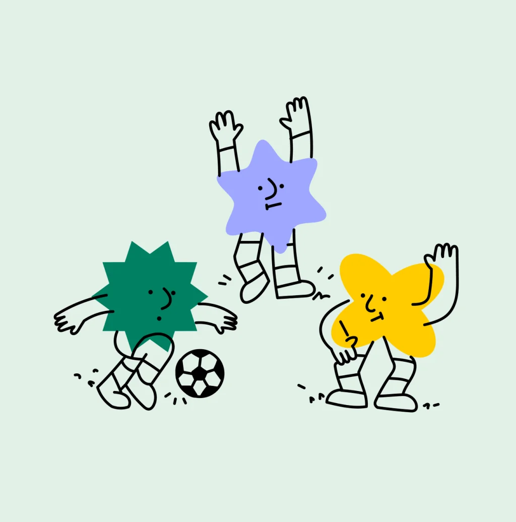
Illustration system
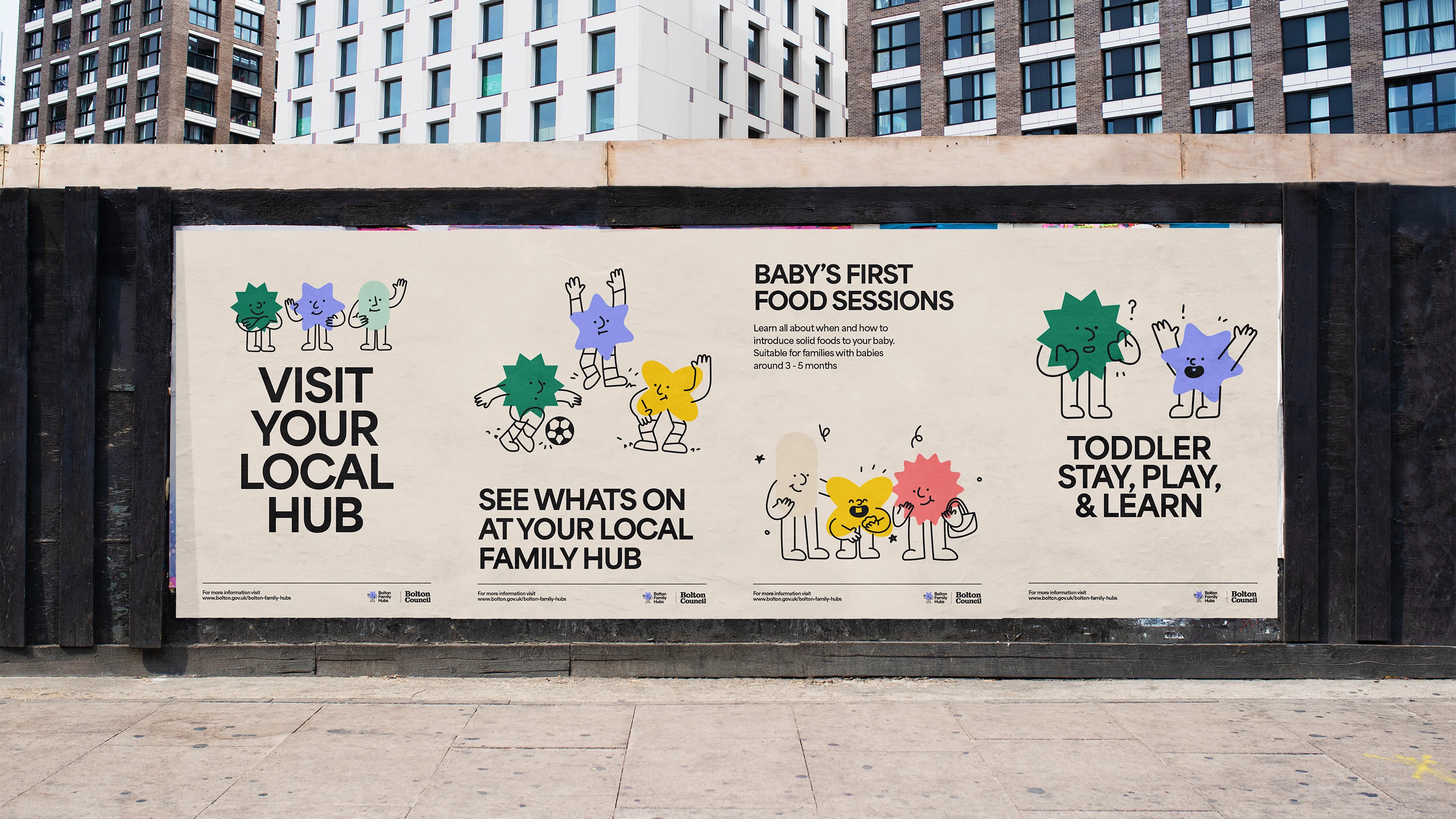
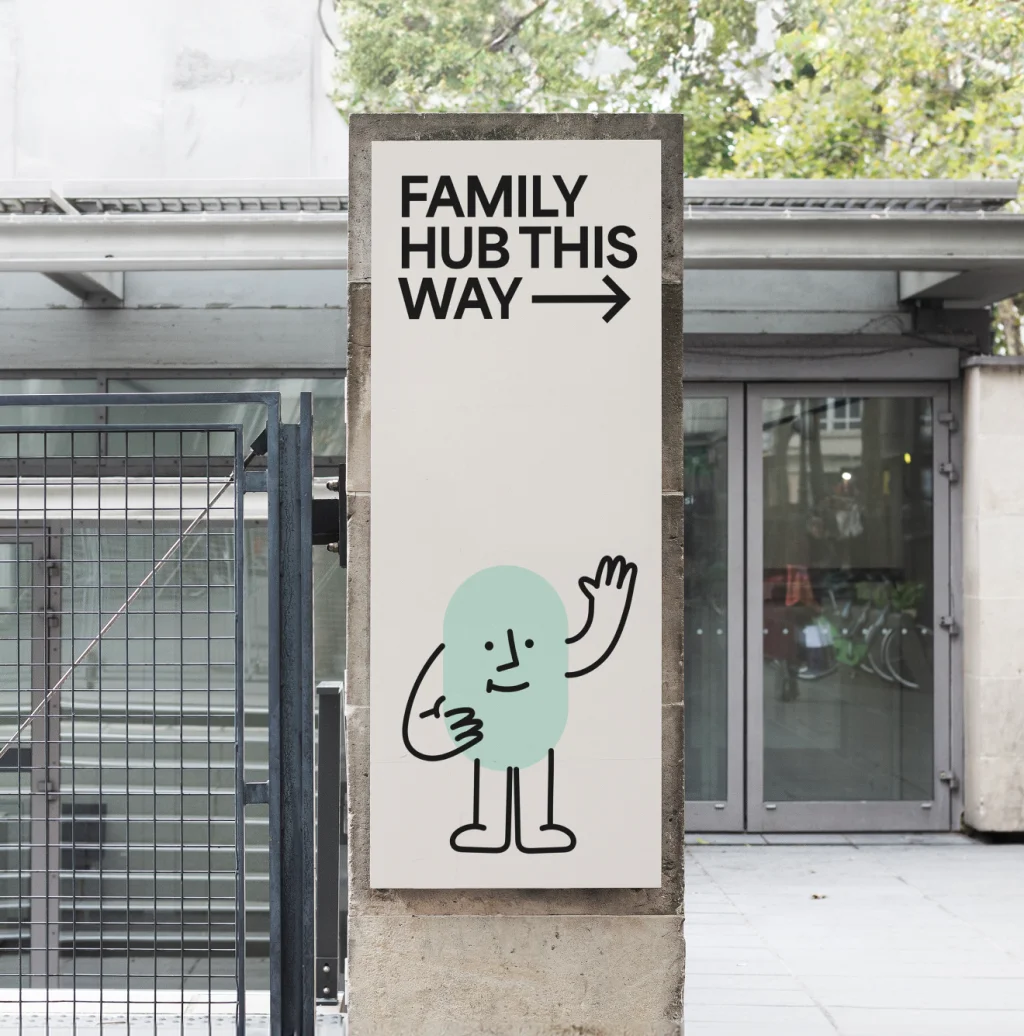
We created a system of illustrated characters based on the simple geometric shapes from the brand toolkit. The little guys are illustrated and animated doing a variety of activities based on things families can do at the Hubs. From painting and playing football, to reading and spending time on laptops, they give the families of Bolton a taste of what they can expect by getting involved. They are also used way-finding and signage, and on print and digital communications, acting like a welcoming face of the brand.
The result
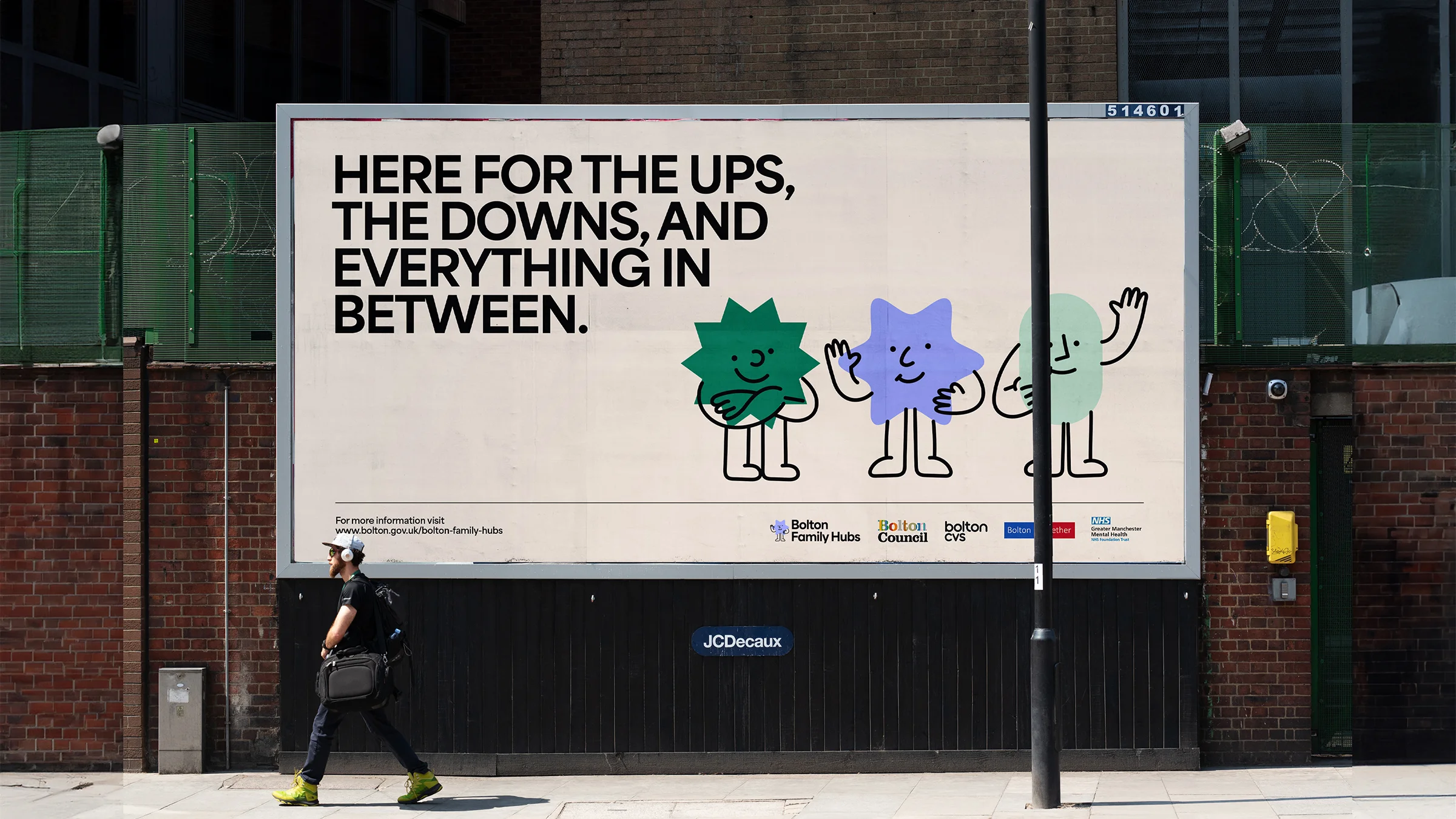
Bolton Family Hubs now have a brand that reflects the diversity of the local community, that is friendly, welcoming and accessible. Involving local families on the development of the brand will hopefully mean they feel connected to the hubs, and will encourage as many people as possible to access help and support.
"We really enjoyed working with Flow on this important project, and are very happy with the new brand for the Family Hubs. It was crucial for us that it felt connected to the local community, and was as welcoming as possible to remove any barriers to access support. Through public consultation and a very collaborative process we’re happy that the brand is inclusive, accessible, and feels right for the hubs. It’s already been really well received and we’re excited to see it in use going forward.”
Contributors & Credits
- Creative Director: Karl Doran
- Design: Josh Taylor
- Illustration: Nadia Kawafi
- Producer: Clare O'Mahoney
- Animation: Nadia Kawafi, James Lawson

