A radical new look for an independent games studio packed with character and an anarchic attitude.
Challenge
Radical Forge have always prided themselves on the culture of their business, and the punk spirit that fuels everything they do. Their brand didn't match their personality though. We created a new identity that represents the rebellious nature of the company.
A characterful brand
Creating a brand with character is all about digging deep into what makes the organisation tick; what gets them excited and the values they live by? Through in-depth brand workshops we found that the defining character for Radical Forge was just as much about their irreverent and rebellious attitude, as it was their technical expertise.
Type mark
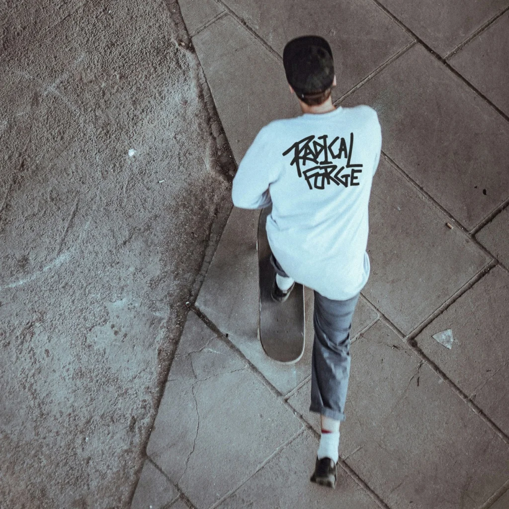
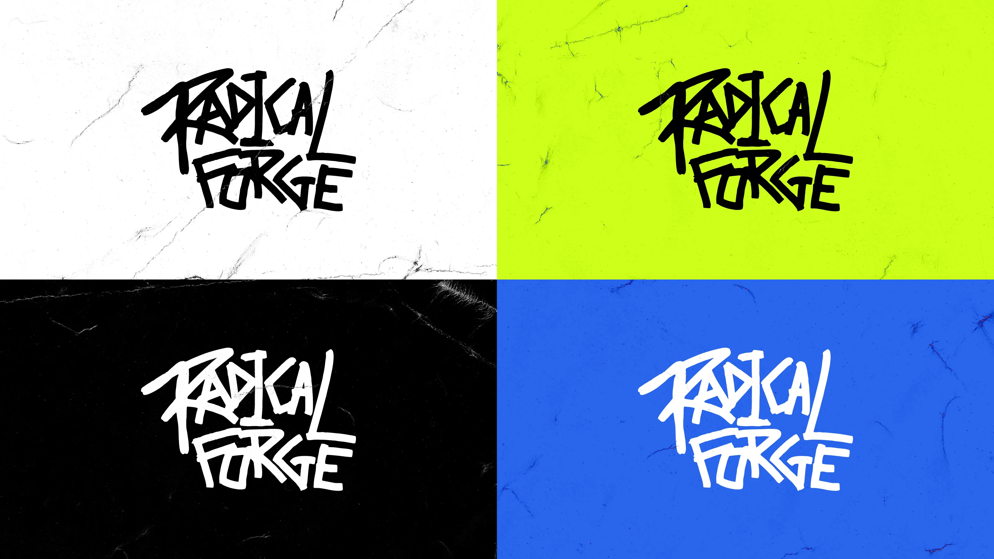
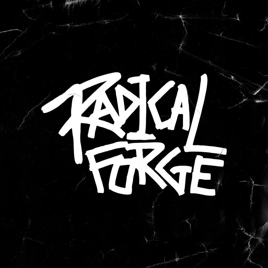
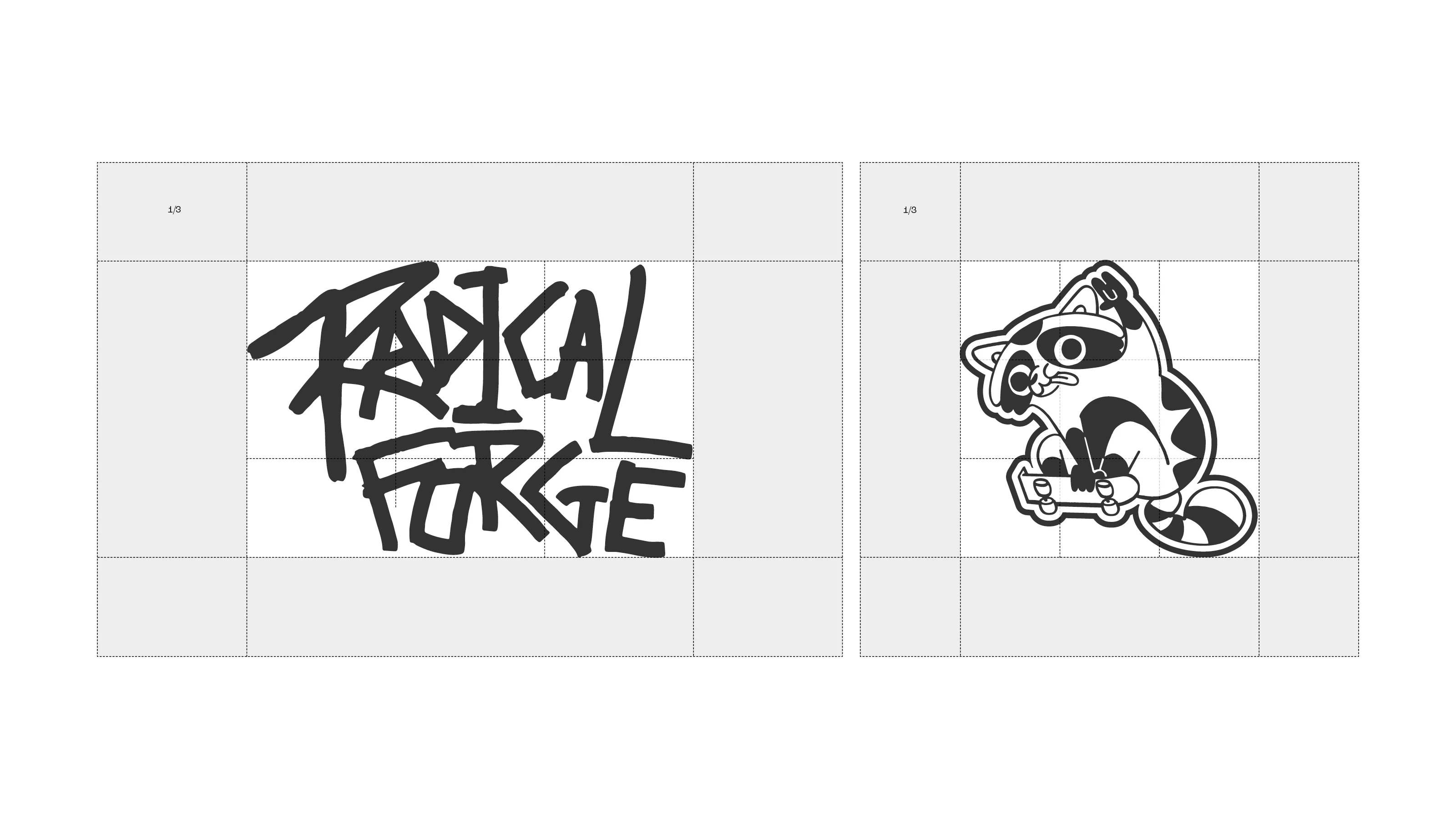
The Radical Forge type mark is full of energy and passion. It’s hand drawn in a thick stroke, (as if it’s been tagged on a wall with a street marker).
The type mark had to be authentic to who they are and feel like it came from the culture of the team, rather than being imposed open them.
Brand mascot Flip!
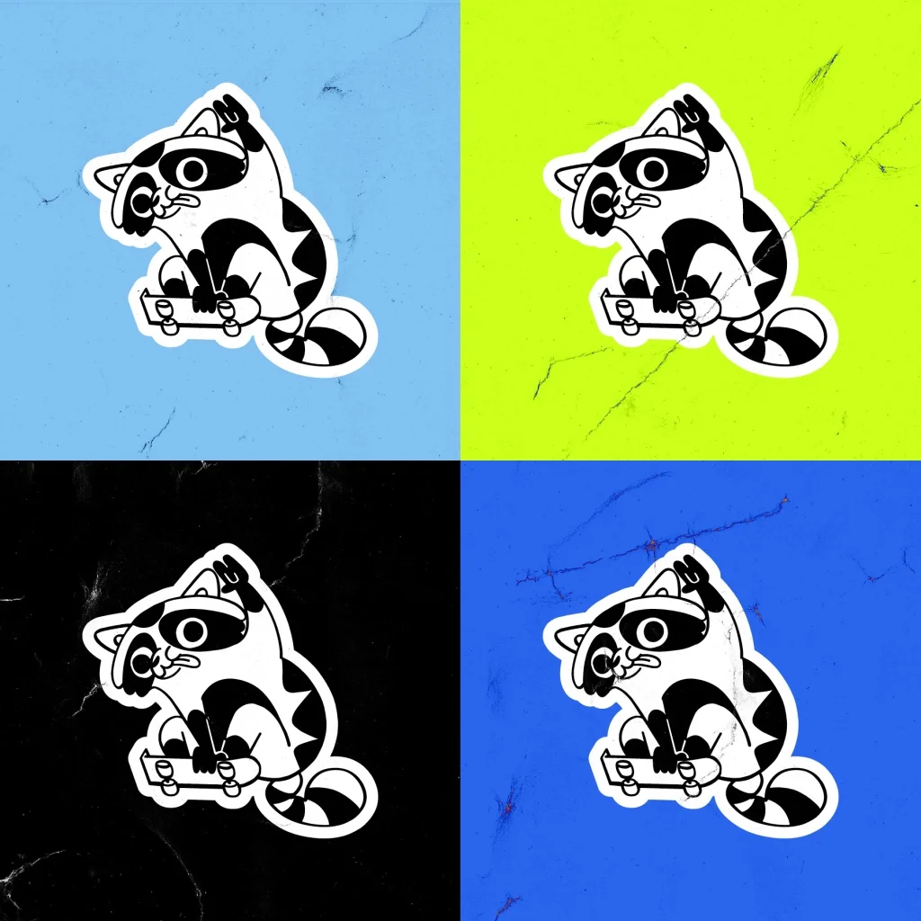
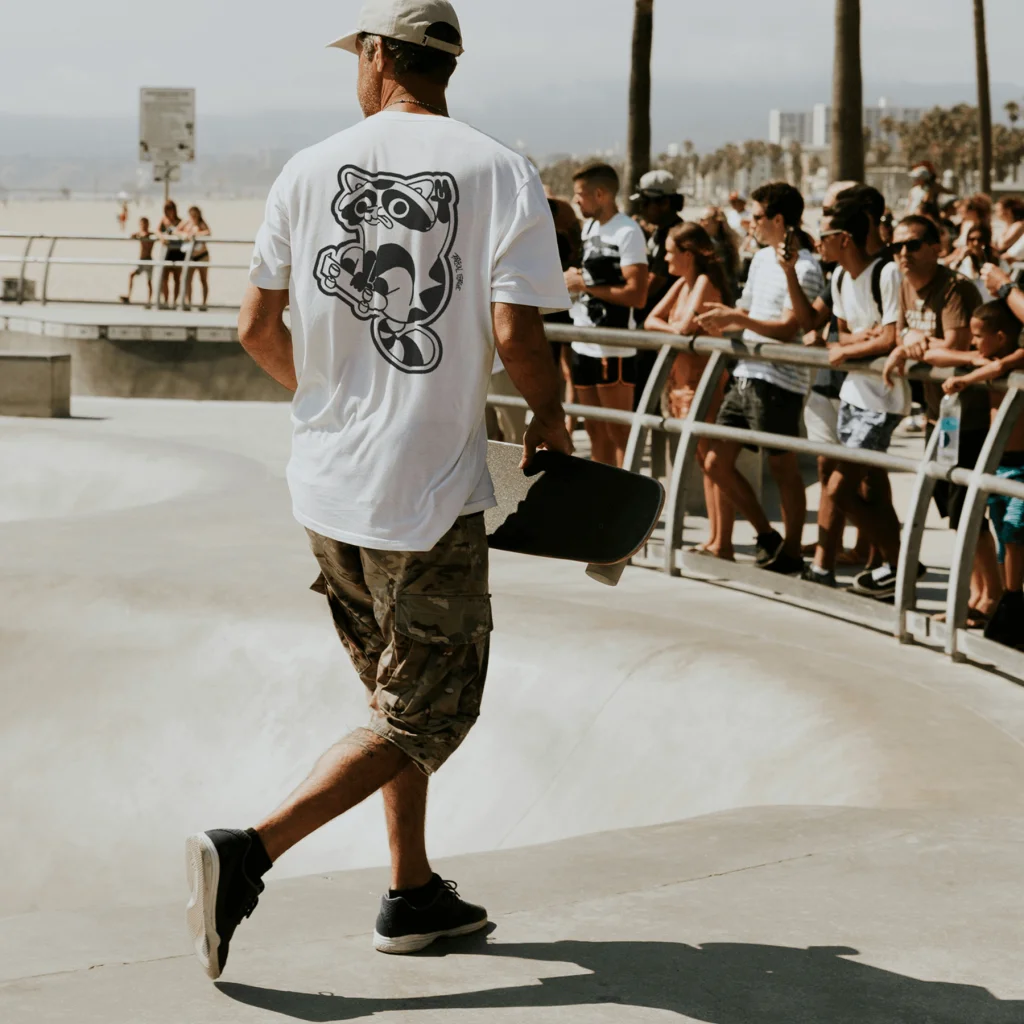
Portraying the character and personality of a brand is always important, but with this brand: it was crucial! We explored a range of ways to do this combining type, iconography and illustrated characters and ended up settling on the use of a brand mascot as a primary brand element.
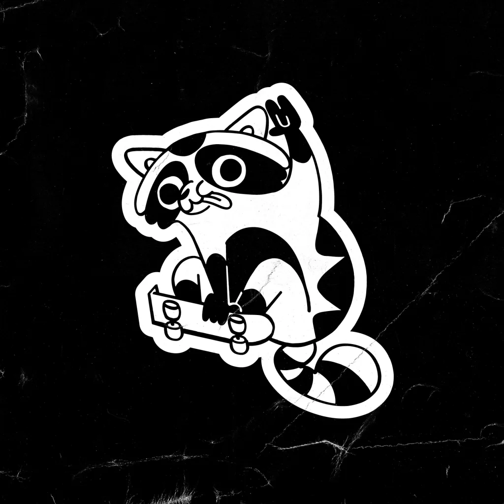
That mascot is Flip! He’s a skateboarding, gaming, music-loving raccoon! He came to symbolise the Radical Forge personality and personify the anarchist attitude of the brand. He can be found flipping an ollie on a presentation, zooming around some social posts, or adorning branded merch, and maybe he’ll even make it into a game one day!
Brand development
We created many ideas iterations. Here’s a selection of some that didn’t quite make it.
A punk attitude
Radical Forge are not your typical games studio, so the brand had to match their unique spirit and the skater culture that defines the team.
We developed a type treatment that has that grungy and edgy attitude, but also feels fresh and contemporary.
An illustration led brand system
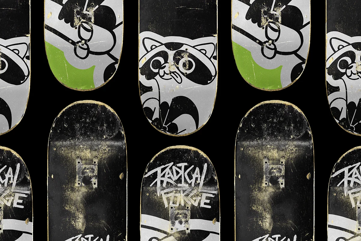
Defining the brand’s personality and distinct identity was essential, a big part of that is the brand mascot, Flip. The style and attitude of the company also had to be communicated through multiple platforms.
Using the mascot as a starting point we developed an illustration style that fits the skater persona of the brand, emulating the stickers that adorn the team’s skateboards.
Colour palette
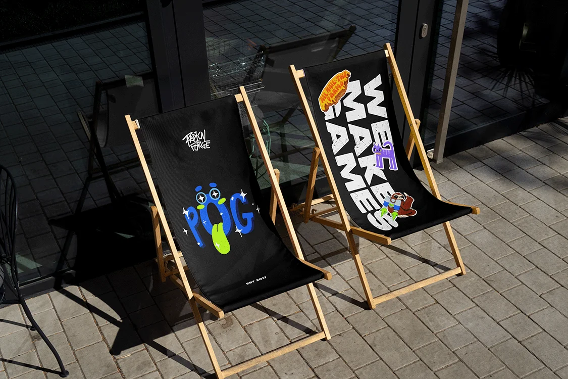
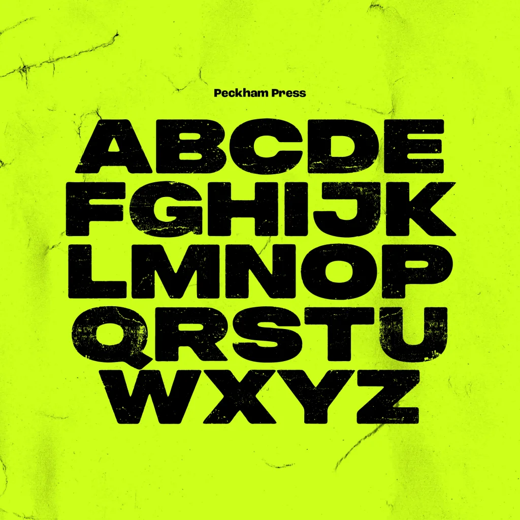
The colour palette draws on punk influences, but is vibrant and digital-first.
It's very different from the corporate blues and steel greys that dominate the games space.
The result
The distinctive and unique brand style perfectly conveys the Radical Forge culture, giving them a genuine point of difference in their sector.
Potential partners, investors and collaborators will be left in no doubt about what they will get from working with this team - a wild ride!
“We had a wild time working with Flow on the next evolution of Radical Forge’s branding. We knew we had to stick true to who we are, and Flow got that. It’s a major challenge to design punk branding for a games studio. This industry often sheds its alternative skin when success comes knocking, but Flow helped us embrace ours and double down.”
Contributors & Credits
- Creative Director: Karl Doran
- Designer: Josh Taylor
- Illustrator: James Lawson, Nadia Kawafi
- Animator: James Lawson, Jim Kuwamura
- Production managemnt: Clare O'Mahoney
- Wed development: James Seddon
