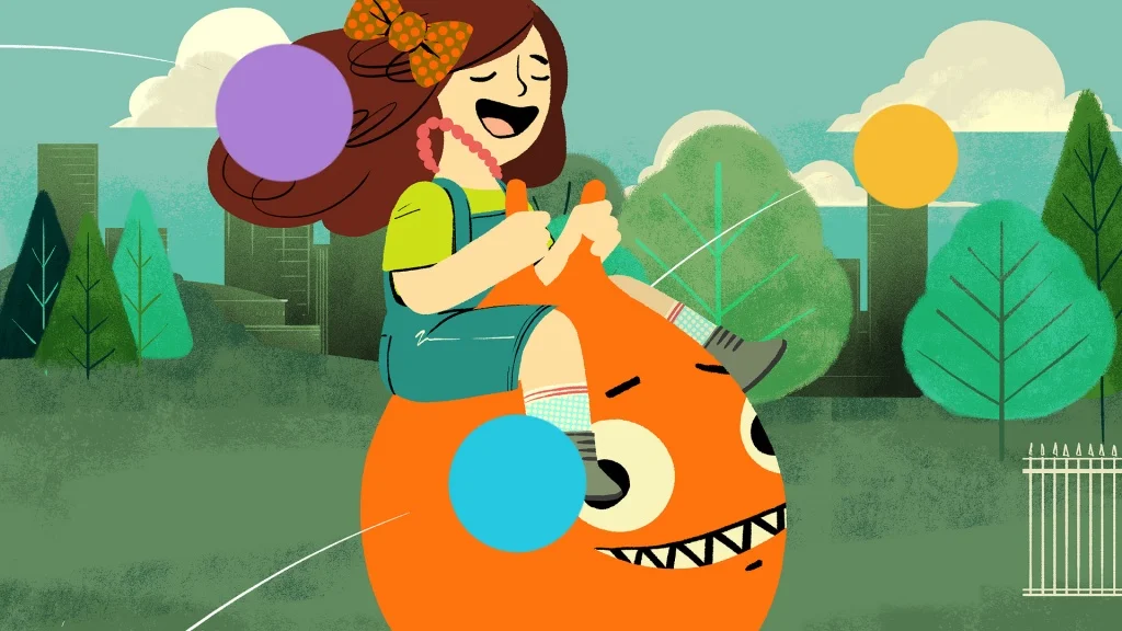
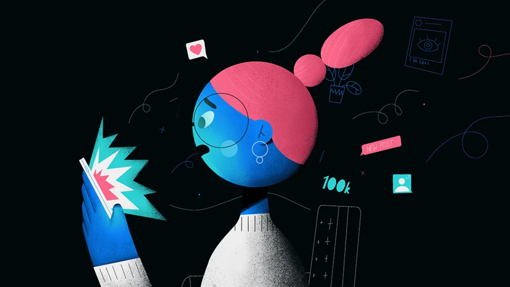
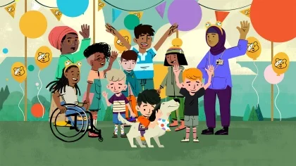
Flow is a multi-award winning creative studio that helps brands connect with people, thorough iconic design, animation and visual storytelling.
Our creative partners
We work as a strategic, creative partner to our clients, helping to shape their brands, tell their stories and move their audiences. From global brands to ambitious startups, our clients all have one thing in common…
Great taste in creative agencies!


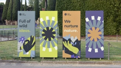
We believe in the power of creativity to change the world. Guided by empathy and insight we help forward-thinking brands forge emotional connections and create positive, meaningful change.
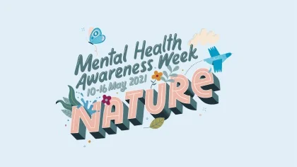
"Our partnership with Flow has been incredibly important to the rapid growth of Mental Health Awareness Week. The key to this relationship is that Flow understands who we are, our tone of voice, and critically how we want to take an empowering approach."
Some awards we have won
Making awesome work while helping amazing organisations effect change is reward enough for us, but occasionally we enter awards too. We've been fortunate enough to win lots over the years, for our work in - film, animation and campaigns, and for Flow as an agency. Here's a few of them.

2021 - Best Creative Campaign

2021 - Best TV and Cinema Commercial

2020 - Best Creative Campaign
2021 - Best Charity / Non-profit Campaign
2021 - Best Online Campaign

2018 - Creative Impact Award
2017 - Branded Content Strategy
2017 - Agency of the Year